A Practical Guide to Test Metrics in Testing Software Quality

Test metrics are the hard numbers you use to track and evaluate how your software testing is really going. They give you objective data to understand the health of your application, spot risks before they become catastrophes, and make smart, informed decisions.
Think of them as a way to turn fuzzy, complex testing results into clear, actionable insights.
Moving Beyond Pass or Fail with Test Metrics
Imagine driving a car where the only gauge on the dashboard is a single light that’s either ‘on’ or ‘off.’ You’d have no idea how fast you’re going, how much fuel is left, or if the engine is about to overheat.
That’s exactly what software development feels like without proper test metrics. It reduces your view to a simple ‘pass/fail,’ giving you no context, no depth, and no real understanding of what’s happening under the hood.

The Power of a Data-Driven Dashboard
Test metrics give your team the crucial dashboard needed to navigate the complexities of software quality. They translate abstract testing activities into concrete numbers that reveal the true health of your application—performance, stability, and efficiency.
This fundamental shift helps your team get out of reactive ‘firefighting’ mode, where you only fix problems after they’ve already hit production. When you can measure and track key indicators, you start anticipating issues before they ever escalate.
By measuring specific outcomes, teams can identify patterns, pinpoint bottlenecks, and validate the impact of their efforts. This data-driven approach turns testing from a simple verification step into a strategic tool for continuous improvement and risk management.
Why Test Metrics Are Essential
A metrics-driven strategy isn’t just about collecting data; it’s about making smarter decisions that directly impact the business. These insights help your team answer critical questions that a simple pass/fail status just can’t.
Here’s why tracking test metrics is a game-changer:
- Objective Quality Assessment: You replace subjective opinions with hard data for a crystal-clear picture of software quality.
- Improved Decision-Making: Stakeholders get the information they need to make informed calls on release readiness and where to allocate resources.
- Process Improvement: You can easily spot and fix inefficiencies in your testing and development cycles.
- Enhanced Predictability: Historical data helps you better estimate timelines and anticipate potential roadblocks in future projects.
To get started, it helps to break down the different kinds of metrics into a few core categories.
Core Categories of Test Metrics
This table gives a quick overview of the main types of test metrics and the critical questions each category helps you answer.
| Metric Category | What It Measures | Key Question Answered |
|---|---|---|
| Functional & Quality | The correctness and completeness of software features against requirements. | ”Does the software do what it’s supposed to do correctly?” |
| Performance & Load | The application’s speed, responsiveness, and stability under various user loads. | ”How does the software perform under real-world stress?” |
| Reliability & Availability | The consistency and uptime of the software over extended periods. | ”Can users depend on the software to be available and stable?” |
| Process Efficiency | The effectiveness and speed of the testing and defect resolution processes. | ”How efficient and effective is our quality assurance process?” |
Each of these categories offers a different lens through which to view your application’s quality, and together, they provide a comprehensive understanding that goes far beyond a simple pass or fail.
When it comes to your software’s health, looking at just one number won’t cut it. You need a complete picture. Think of it like a doctor’s check-up—they don’t just take your temperature; they check your heart rate, blood pressure, and cholesterol to understand your overall health. Each measurement tells part of a larger story.
In software, that story is told through four essential pillars of test metrics. Each one gives you a unique perspective, and together, they build a solid foundation for understanding your product’s stability, performance, and real-world effectiveness.

Pillar 1: Functional and Code Quality Metrics
This first pillar gets straight to the point, answering the most fundamental question: “Does the software actually do what it’s supposed to?” Functional and code quality metrics are the bedrock of QA, measuring how well the app meets its requirements and how clean the underlying code is.
A crucial metric here is Defect Density. It calculates the number of confirmed bugs found in the software, usually measured per thousand lines of code (KLOC). A high defect density is a major red flag, often pointing to a module that’s overly complex, poorly written, or just hasn’t been tested enough.
While top-tier organizations aim for a defect density below 1 defect per KLOC, industry averages often sit between 5-15 during early development. The impact is real: one analysis showed that teams who cut their defect density by 20% saw production outages drop by a staggering 35%.
Pillar 2: Performance and Load Metrics
Once you know the software works, the next question is obvious: “How well does it perform under pressure?” Performance and load metrics reveal your application’s speed, responsiveness, and stability when faced with real-world user traffic. This is where you find out if your app is built for a sprint or a marathon.
Key metrics to watch include:
- Response Time: How long does it take for the app to respond to a user request? A slow response time is a direct path to user frustration.
- Throughput: How many requests or transactions can the system handle over a specific period? This helps you understand your application’s true capacity.
- Error Rate: What percentage of requests result in an error? A sudden spike during a load test is a clear sign of a bottleneck somewhere.
These aren’t just technical numbers; they directly translate to user experience. A system that’s functionally perfect but painfully slow is, for all practical purposes, broken.
Pillar 3: Reliability and Availability Metrics
This pillar is all about long-term stability and dependability. It answers the question, “Can our users consistently count on our software to be there and work correctly?” These metrics are crucial for building customer trust and protecting your brand.
The most famous metric here is Mean Time Between Failures (MTBF). It measures the average time that passes between one system failure and the next. The higher the MTBF, the more reliable your system is.
Think of MTBF as a measure of your system’s resilience. It tells you how long your application can run smoothly before something inevitably goes wrong. The goal is to make that interval as long as possible through robust design and effective testing.
Another vital metric is Availability, often shown as a percentage like 99.999% uptime. It measures the proportion of time the system is operational and accessible. For most businesses, even a fraction of a percent of downtime can mean significant revenue loss.
Pillar 4: Process Efficiency Metrics
Finally, measuring the product isn’t enough; you also have to measure the process you use to build and test it. Process efficiency metrics help you answer: “How effective is our quality assurance process?” This creates a feedback loop for continuous improvement within your engineering team. For a deeper dive, check out our guide on how to measure software quality.
A standout metric here is Defect Removal Efficiency (DRE). It calculates the percentage of bugs you find and fix before the software ever makes it to production.
The formula is simple: (Bugs found internally / (Bugs found internally + Bugs found by users)) x 100. A high DRE means your testing process is doing its job by catching issues early, which is always cheaper and less disruptive than fixing them after release.
Let’s tie these concepts together and see how they directly connect to what the business cares about most: growth, customer satisfaction, and the bottom line.
Essential Test Metrics and Their Business Impact
This table offers a detailed look at key metrics from each pillar, connecting technical measurements to tangible business outcomes.
| Metric Name | Pillar | What It Measures | Why It Matters to the Business |
|---|---|---|---|
| Defect Density | Functional & Code | The number of confirmed defects per unit of code size (e.g., KLOC). | Lower density reduces support costs and improves brand reputation. |
| Response Time | Performance & Load | The time taken for the system to respond to a user action. | Faster response times directly correlate with higher user engagement and conversion rates. |
| Mean Time Between Failures (MTBF) | Reliability & Availability | The average time a system operates without failure. | A high MTBF builds customer trust and reduces revenue loss from outages. |
| Defect Removal Efficiency (DRE) | Process Efficiency | The percentage of defects found before a release. | High DRE lowers the cost of quality by catching bugs when they are cheapest to fix. |
| Availability (Uptime) | Reliability & Availability | The percentage of time the service is operational. | Directly impacts revenue, customer satisfaction, and SLA compliance. |
| Error Rate | Performance & Load | The percentage of user requests that result in an error. | A low error rate ensures a smooth user journey and prevents customer churn. |
Ultimately, these four pillars provide a balanced framework for evaluating your product from every critical angle, ensuring you’re not just building features, but building trust.
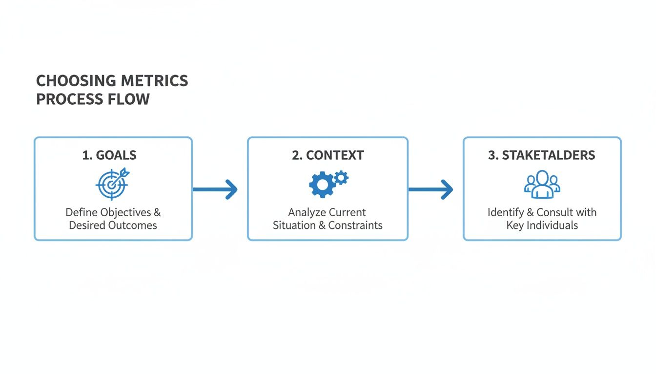
How to Choose Metrics That Actually Matter
Not all metrics are created equal. It’s easy to fall into the trap of tracking “vanity metrics”—numbers that look impressive on a dashboard but tell you nothing about software quality or user satisfaction. Measuring the total number of tests you run might feel productive, but it doesn’t say a thing about whether those tests were any good.
Choosing the right test metrics in testing is like a pilot picking instruments for different phases of a flight. The gauges you need for takeoff are completely different from what you watch at cruising altitude. To get actionable data, your metrics have to be directly wired to your project’s goals.
Start with Clear Objectives
Before you track a single number, you have to define what success actually looks like. The best metrics are the ones that directly measure progress toward a specific, tangible goal. Vague ambitions like “improve quality” are useless.
You need to frame your goals with precision. For example:
-
Goal: “Cut the number of critical bugs reaching production by 25% this quarter.”
-
Metrics to Watch: Defect Escape Rate, Defect Removal Efficiency.
-
Goal: “Get the checkout page to load in under two seconds for 95% of users.”
-
Metrics to Watch: 95th Percentile (P95) Response Time, Throughput.
When you start with a clear target, you instantly filter out all the noise. The metrics you choose become a compass, guiding every engineering decision toward that outcome and ensuring every number has a purpose.
A metric is only as valuable as the action it inspires. If it doesn’t help you make a better decision about your product or process, it’s just noise.
This goal-first approach transforms your dashboard from a simple report card into a strategic tool you can actually use.
Align Metrics with Project Context
The context of your project completely changes which metrics are most relevant. A fast-moving startup pushing out an MVP will care about different things than a huge enterprise maintaining a critical financial system. Your development methodology plays a huge role, too.
For instance, an Agile team focused on quick iterations will probably track metrics that give them fast feedback. Think Cycle Time (how long it takes for a change to hit production) and Change Failure Rate (what percentage of deployments cause a production failure). These numbers tell them if they’re moving fast without breaking things.
On the other hand, a team using a more traditional Waterfall model for a high-stakes project will focus more on comprehensive, upfront quality checks. Their go-to metrics would likely be Test Coverage Percentage and Requirement Defect Density, making sure every feature is bulletproof before a big release. The key is to pick metrics that match your team’s workflow and risk tolerance.
Involve Stakeholders in the Conversation
Metrics aren’t just for the engineering team; they’re a communication tool for the whole company. When you’re deciding what to measure, you have to bring product managers, business analysts, and even executives into the room. This ensures the data you collect actually answers the questions that matter to the business.
A product manager might be obsessed with metrics tied to user satisfaction, like Error Rate and Application Crash Rate. At the same time, a business leader will care more about Availability (Uptime) and Mean Time To Resolution (MTTR) because those numbers directly hit the bottom line and brand reputation.
By including everyone, you build a shared understanding of what “quality” even means and create a common language for talking about it. This turns your testing data into a powerful story that drives real conversations, justifies resources, and gets the entire company focused on shipping a great product. This way, your test metrics in testing do more than fill a report—they drive real, measurable improvements.
Capturing Realistic Performance Metrics with Traffic Replay
Traditional load testing often feels like a weather forecast—it gives you a general idea of what to expect, but it rarely captures the chaotic, unpredictable nature of a real storm. You can painstakingly script user journeys and simulate traffic, but these synthetic tests often miss the mark. They simply can’t replicate the unique, sometimes illogical, ways actual users interact with your application.
This is a huge problem. How can you be confident your system will hold up under the pressure of a Black Friday sale or a viral marketing campaign if your tests don’t mirror that reality? The gap between simulated tests and real-world behavior is where critical performance issues hide, just waiting to cause an outage at the worst possible moment.
The Problem with Synthetic Load Tests
Synthetic load tests are built on assumptions. You assume how many users will log in, what pages they’ll visit, and in what order. But real users are messy. They abandon carts, click the same button ten times, and navigate in ways you never anticipated.
These edge cases and unique user flows create a complex traffic pattern that synthetic scripts struggle to replicate. As a result, your performance metrics—like latency, throughput, and error rates—might look great in your test environment but completely fall apart under the weight of actual production traffic.
The core challenge is authenticity. If the test traffic doesn’t accurately reflect real user behavior, the performance metrics you collect are not just inaccurate; they’re dangerously misleading. You might deploy a new feature with confidence, only to discover a hidden bottleneck that synthetic tests completely missed.
This is where a different approach becomes essential. Instead of guessing what your users might do, why not use what they actually do?
Simulating Reality with Traffic Replay
Traffic replay is a powerful technique that bridges this gap. It works by capturing live user traffic from your production environment and then “replaying” it against a staging or test environment. Think of it like recording a live concert and then playing it back in a sound studio to fine-tune the mix. You’re using the real performance to test your equipment.
Tools like GoReplay are designed for this exact purpose. They act as a listener on your production server, silently recording incoming HTTP requests without impacting performance. This captured traffic, containing all the nuances of real user behavior, becomes the ultimate test script.
This process shows the foundational steps for choosing effective metrics, starting with clear goals and understanding the project context. This framework ensures that any data collected, especially from advanced methods like traffic replay, is tied to meaningful business outcomes.
The Traffic Replay Workflow
Implementing a traffic replay strategy is surprisingly straightforward. The workflow transforms raw production data into actionable performance insights, giving you some of the most realistic test metrics possible.
The process typically unfolds in these steps:
- Capture Production Traffic: First, deploy a lightweight agent (like GoReplay’s listener) to your production environment. It captures a copy of the live HTTP traffic and saves it to a file, all without adding noticeable overhead.
- Set Up the Test Environment: Next, prepare a staging or testing environment that’s a close replica of your production setup. The goal is to make this environment as identical as possible to ensure the test results are valid.
- Replay the Traffic: Using the replay tool, direct the captured traffic against your test environment. You can control the speed, allowing you to simulate normal load or amplify it to stress-test your system’s limits (e.g., replaying at 2x or 10x the original speed).
- Analyze the Metrics: As the traffic is replayed, monitor the test environment using your Application Performance Monitoring (APM) tools. This is where you collect the critical performance metrics.
By following this workflow, you move from guesswork to data-driven validation.
Key Metrics to Collect with Traffic Replay
Because you’re using real-world scenarios, the metrics you collect are incredibly accurate. You can measure exactly how your system responds to the kind of load it will face in production.
Here are the crucial performance metrics you can gather:
- P95/P99 Latency: Instead of just average response time, traffic replay lets you see the latency experienced by the 95th or 99th percentile of users. This is vital for understanding the experience of your slowest users, who are often the first to notice performance degradation.
- Peak Throughput: By replaying traffic from your busiest hour, you can find your system’s true maximum throughput (e.g., requests per minute) before performance starts to suffer.
- Error Rate Under Load: Identify the exact point at which your system starts generating errors (5xx server errors, for example) when overwhelmed. This helps you set realistic capacity limits and configure auto-scaling rules.
- Resource Utilization: Monitoring CPU, memory, and I/O on your test servers during replay shows you exactly which resources become bottlenecks under real load.
This level of detail is invaluable for preemptively identifying and fixing issues. If you want to explore this topic further, our detailed guide explains how traffic replay improves load testing accuracy. By simulating true user interactions, you can confidently validate that your application is ready for anything.
How to Interpret Your Results and Drive Action
Collecting data is just the starting point. Raw numbers on a dashboard—a 250ms response time, a defect density of 2.1—don’t mean a thing on their own. The real magic of test metrics happens when you weave that data into a clear story, one that explains what’s happening, why, and what you should do next.
This is where you turn numbers into action.
The biggest trap teams fall into is reacting to isolated data points. A single latency spike or one failed test can trigger panic, but without context, it’s just noise. Real analysis is about spotting the patterns and understanding the story your metrics are telling over time.
From Snapshots to Storylines
Don’t look at metrics as a single photo; think of them as a time-lapse video. A single data point shows you how the system performed in one brief moment. A trend, on the other hand, reveals its true behavior, its weaknesses, and where it’s headed.
To build this narrative, you need to:
- Establish a Baseline: Before you can label a number “good” or “bad,” you need a baseline. This is your system’s normal heartbeat—its typical performance under everyday conditions. Capture metrics over a normal period to understand your standard response times, error rates, and resource usage. This baseline becomes the yardstick for everything else.
- Analyze Trends Over Time: Plot your key metrics on a graph and watch them over days, weeks, or even entire release cycles. Is the average response time slowly creeping up after each deployment? Did the defect escape rate drop after adopting a new testing strategy? These are the trends that tell the real story.
- Correlate Metrics to Find Root Causes: No metric lives in a silo. When you spot a problem, the next step is to connect different data points to figure out why it happened. A spike in the Error Rate is a symptom; the root cause might be hidden in the CPU utilization, database query times, or deployment logs from that exact same period.
For example, let’s say the P99 Latency for your checkout API just doubled. Don’t stop there. Overlay that data with your Throughput metric. Did the slowdown coincide with a traffic spike? If not, check your deployment history. A code change that went live right before the spike is your prime suspect. This kind of correlation turns a vague “it’s slow” complaint into a specific, actionable insight: “this deployment tanked our performance.”
Setting Meaningful Thresholds and Alerts
Once you have a baseline, you can finally define what “good” and “bad” actually mean by setting thresholds. These are your tripwires—predefined limits that trigger an alert when crossed. This puts your monitoring on autopilot, freeing you from staring at dashboards all day.
But a good threshold is more than just a random number.
A threshold should represent the exact point where user experience or business impact is at risk. For instance, don’t set an alert for 90% CPU usage. Instead, set an alert for when P95 latency exceeds the 2-second mark that research shows makes users leave. Tie your alerts to real-world outcomes, not just system stats.
This approach ensures that when an alert goes off, it signals a real problem that needs your attention now. It cuts through the noise, prevents alert fatigue, and keeps your team focused on what actually matters.
Transforming Data into a Compelling Narrative
Your final, and most critical, job is to communicate what you’ve found. Stakeholders don’t want a spreadsheet full of raw numbers; they need a clear, concise story that helps them understand risks and make smart decisions.
Use your trend analysis and correlated data to build that story. Instead of just saying, “The error rate was 5%,” tell them this:
“After we deployed the new recommendation engine last Tuesday, the error rate for our mobile API jumped from 0.5% to 5%, affecting an estimated 10,000 users. This spike lines up perfectly with a surge in database load, pointing to an inefficient query in the new module.”
Now that is a powerful narrative. It connects a technical metric to a specific cause and a tangible business impact. It transforms your test metrics from a boring report into a strategic tool, creating a feedback loop that drives real, continuous improvement in your software.
Common Questions About Test Metrics
As your team gets more serious about data, you’re bound to run into a few tricky questions. Figuring out the practical side of using test metrics in testing is what separates the teams that succeed from those who just get buried in spreadsheets.
Let’s clear up some of the most common hurdles so you can build a metrics program that actually works.
How Many Test Metrics Should My Team Track?
It’s so easy to fall into the trap of measuring everything. But that path usually ends in “analysis paralysis,” where you have tons of data but no real direction. The trick is to start small and stay laser-focused.
I always recommend teams begin with just three to five key metrics that tie directly to their most critical project goals. For a brand-new feature launch, that might be Defect Density and API Response Time. If you’re working on a mature, stable system, your focus might shift to something like Mean Time to Resolution (MTTR), because getting things fixed fast is what matters most.
The goal is to get actionable intelligence, not just fill a dashboard. Every so often, look at your metrics and ask a simple question: “Is this number still helping us make better decisions?” If not, it’s time to ditch it for something more useful.
What Are Vanity Metrics in Software Testing?
Ah, vanity metrics. These are the numbers that look amazing in a slide deck but tell you absolutely nothing about software quality or whether you’re building the right thing. They feel great to share, but they’re a dangerous distraction from what really counts.
The all-time classic is “Total Number of Tests Executed.” A huge number looks impressive, right? But it’s meaningless on its own. It doesn’t tell you if those tests covered critical user journeys or if they found any important bugs. It’s just noise.
Instead, focus on metrics that are tied to outcomes. Things like Defect Removal Efficiency or the Percentage of Bugs Found Pre-Production tell a much more powerful story. They show the real value your testing delivers by stopping problems before they ever see the light of day.
How Can We Get Started with a Metrics Program?
You don’t need a massive, top-down initiative to start seeing the benefits of a metrics program. The best way to get going is with a simple, manageable approach that builds momentum over time. A straightforward, four-step strategy usually works wonders.
- Define a Clear Goal: Start with one specific, measurable objective. Something like, “Let’s reduce critical production bugs by 20% this quarter.”
- Select One or Two Metrics: Pick metrics that directly track that goal. In this case, the Defect Escape Rate is a perfect fit.
- Automate Data Collection: Don’t do this manually. Use your existing CI/CD pipeline, APM tools, or test management software to grab the data for you. It keeps things consistent and saves everyone a headache.
- Communicate and Iterate: Share what you’re learning with the whole team. The key is to frame it as a tool for improvement, not a way to place blame. Use what you find to make small, smart changes to your process.
This way, adopting test metrics in testing feels like a natural part of your workflow, not another chore. It becomes the engine for continuous improvement, built from the ground up.
Ready to capture the most realistic performance metrics for your application? GoReplay empowers you to replay real user traffic in your test environments, uncovering critical issues before they impact customers. Start testing with true-to-life data today.