Mastering Software Testing Reporting From Data to Decisions

Software testing reporting is simply the process of documenting and summarizing what happened during your testing cycles. But it’s so much more than a simple log file. These reports provide critical insights into product quality, reveal trends in defects, and ultimately tell you if you’re ready to ship. Think of it as the communication bridge between the QA team, developers, and project stakeholders.
Why Software Testing Reporting Is Your QA Compass
Imagine you’re captaining a ship on a long voyage. You wouldn’t dream of setting sail without a compass, charts, and a detailed ship’s log. In the world of quality assurance, software testing reporting is your navigation system. It’s not some bureaucratic chore; it’s the tool that guides your entire development journey from start to finish.
A great test report doesn’t just list what was tested. It turns raw data into strategic intelligence, telling a story about the software’s health, pointing out potential risks, and giving a clear signal on its readiness for launch. The trick is that this story needs to be told a little differently for each person reading it.
For a developer, the report is a detailed map leading directly to a specific bug’s location. For a project manager, it’s more like a high-level weather forecast, warning of potential storms (like blocker bugs) or promising clear skies (a green light for release). And for an executive, it’s the ship’s logbook summary—a quick, concise overview that confirms the voyage is on track.
The Foundation of Effective Communication
At its heart, reporting is all about communication and getting everyone on the same page. When you have clear, actionable reports, you break down the silos that form between teams, ensuring everyone from QA to operations is working from the same information.
The most basic form of this communication? A good old-fashioned bug report. In fact, bug reports are the most common testing document out there, with 47% of testers using them as their primary way to communicate defects. This just goes to show how vital clear documentation is for closing the gap between finding a problem and fixing it. You can dig into more stats in this software testing services industry report.
A test report isn’t just a record of the past; it’s a predictive tool for the future. By analyzing trends in test failures and defect discovery rates, teams can anticipate future challenges and adjust their strategies accordingly.
Driving Proactive Maintenance and Strategy
Good reporting doesn’t just help you fix today’s problems; it helps you prevent tomorrow’s. By feeding data from these reports into your broader IT operations, you can build smarter preventive and corrective maintenance strategies.
For instance, if your reports consistently flag issues in a particular module, that’s a huge signal. It tells you that something deeper might be wrong, maybe pointing to a need for an architectural review or some serious refactoring. This approach turns the QA process from a reactive bug hunt into a strategic driver for quality, setting your product up for long-term stability and success.
What Goes Into a Truly Actionable Test Report?
A powerful test report does more than just dump data on your team; it tells a compelling story about your software’s quality. To be genuinely useful, it needs a clear structure that guides everyone—from executives to engineers—from the big picture down to the nitty-gritty details. Think of it as a well-organized dossier, where each section builds on the last.
Every great report kicks off with an executive summary. This is the 30,000-foot view, written specifically for project managers, product owners, and other stakeholders who need the bottom line, fast. Keep it concise, ditch the technical jargon, and answer the most critical question first: “Are we good to go for release?”
After the summary, you dive into the specifics. This is where you’ll find detailed test execution logs and defect breakdowns. This section is for the developers and QA engineers who need to see exactly which tests passed, which failed, and a categorized list of every bug found during the cycle.
Finally, every actionable report must document the environment configuration. This part details the hardware, software, and network settings used for testing. It’s absolutely crucial for reproducibility, making sure developers can actually replicate and squash any bugs you report.
Key Metrics That Tell the Full Story
While structure provides the frame, the metrics inside are what give a report its real muscle. Numbers without context are just noise. The real goal is to turn that data into insights that actually drive decisions.
This is where a “QA Compass” mindset helps. It’s all about using bug details to get a read on overall product health and, ultimately, make a confident call on release readiness.
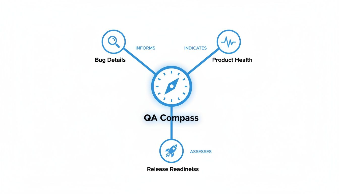
This visual shows how every piece of the puzzle—from a single bug report to high-level health indicators—all points toward that one critical goal: assessing if you’re ready to ship.
To get there, you need to track the right things. Here are a few of the most critical metrics you’ll find in any solid test report.
Essential Software Testing Report Metrics
This table breaks down the most critical metrics to include in any test report, explaining what each one measures and why it is important for stakeholders.
| Metric | What It Measures | Why It Matters |
|---|---|---|
| Test Pass/Fail Rate | The percentage of test cases that passed versus those that failed. | A high pass rate suggests stability; a sudden drop can signal a major regression in a new build. |
| Defect Density | The number of confirmed defects per unit of code (e.g., per 1,000 lines). | A rising defect density often points to accumulating technical debt or a problematic module. |
| Severity vs. Priority | Severity is the bug’s technical impact on the system. Priority is its impact on the business. | Helps teams focus on what’s most important. A low-severity typo on the homepage is a high-priority fix. |
| Escaped Defects | The number of bugs discovered in production after a release. | This is a major red flag. A high number means your testing process has serious gaps that need to be fixed. |
By tracking these core metrics, a test report becomes more than a simple status update. It transforms into a diagnostic tool that helps teams pinpoint weaknesses, manage risk, and make smart, informed decisions about product quality.
Turning Data Into Decisive Action
Ultimately, the whole point of reporting is to empower your team to act. A consistently high pass/fail ratio tells you releases are stable. A spike in Sev-1 incidents means it’s time to hit the brakes and rethink your reporting.
For example, if the Escaped Defects metric starts ticking upward, that’s a clear signal to the QA lead that the current regression suite isn’t cutting it. That data gives them the justification they need to get resources for expanding test coverage or trying out new testing methods. You can learn more about refining your approach in our guide covering the essential metrics for software testing.
Without these metrics, you’re flying blind, and problems will fester until they blow up into a major incident.
Choosing the Right Report for the Right Audience
Blasting a single, massive document to everyone in the company is a surefire way to get your testing reports ignored. You wouldn’t use a microscope to look at a mountain range, so why send a developer-level bug log to an executive? The real secret to making an impact is tailoring the message, format, and detail to who’s reading it.
One size fits all just doesn’t work here. Sending the wrong report to the right person just creates noise, not clarity. It’s all about delivering focused intelligence that helps each person make the right decisions for their role. When you get this right, reporting stops being a chore and becomes a genuinely strategic tool.
Reports for the Agile Team
For the developers, QA engineers, and scrum masters in the trenches, information has to be frequent, detailed, and immediately useful. These reports are the lifeblood of the daily development cycle, providing the instant feedback needed to keep a sprint on track.
-
Daily Progress Reports: Think of this as the team’s daily stand-up, but in writing. It’s a quick snapshot of what tests were run, what new defects popped up, and if anything is blocking progress. The audience is the core project team, and the purpose is purely operational awareness.
-
Test Execution Reports: This is where you get into the granular, technical weeds. It gives developers a clear roadmap to replicate and squash bugs, spelling out every test step, the environment config, and the exact point of failure. The goal is simple: enable efficient bug resolution.
These reports are built for speed and precision. Technical accuracy trumps a polished presentation every time. They answer one critical question: “What do we need to fix right now?”
Reports for Project and Product Leadership
Moving up a level, you have project managers, product owners, and QA leads. They need a broader perspective. They aren’t getting bogged down in single lines of code; they’re looking for trends, risks, and the overall health of the project. Their reports need to roll up the data to show the bigger picture.
The goal for leadership-focused reports is to translate technical data into business impact. It’s less about the individual bug and more about what the pattern of bugs means for the release timeline and product quality.
Defect Summary Reports are a perfect example. These are often the main event in triage meetings. They group bugs by severity, priority, and which part of the application they affect, helping the team decide which issues pose the biggest threat to the user experience and business goals.
Another key document is the Requirement Traceability Report. This one is indispensable for business analysts and product owners. It draws a straight line from each business requirement to the specific test cases that prove it works, offering clear evidence that what was built matches what was asked for. This is the ultimate tool for ensuring nothing gets missed.
Reports for Executive Stakeholders
Finally, at the top, you have executives and key business stakeholders. They have the least amount of time and need the most condensed information possible. They need a clear, unambiguous summary to gauge business risk and make those big go/no-go decisions.
Here are the key reports for this group:
-
Test Summary Report: This is the high-level overview of the entire testing effort for a specific cycle or milestone. It highlights essential metrics like total tests passed vs. failed, the number of critical open defects, and gives an overall assessment of product stability.
-
Test Closure Report: Prepared right at the end of a major release cycle, this is the final sign-off. It recaps the entire testing journey, confirms all exit criteria were met, and calls out any known issues or residual risks that will be carried over into production. Its purpose is to provide final release confidence.
By thoughtfully picking the right type of software testing report for each audience, you make sure your message is always relevant, understood, and—most importantly—acted upon. This kind of targeted communication is the hallmark of a mature and effective QA process.
How Automation Is Revolutionizing Test Reporting
Let’s be honest, manually compiling software testing reports is a classic bottleneck. It’s a slow, error-prone slog that often delivers data so old it’s irrelevant by the time anyone sees it. This old-school approach just can’t keep up with modern development, turning reporting from a strategic tool into a dreaded chore.
Fortunately, that way of working is quickly becoming a thing of the past. Automation is completely reshaping how we think about reporting. Modern tools are swapping out static spreadsheets for dynamic, real-time dashboards that give you an instant pulse on your product’s quality.
Platforms like Jira, TestRail, and PractiTest are leading this charge. They ditch the tedious data entry and instead offer up interactive dashboards full of customizable widgets, letting QA leads and DevOps teams track quality trends as they happen—not days after the fact.
From Static Documents to Dynamic Dashboards
The real magic of automation in software testing reporting is the jump from a static process to a dynamic one. Instead of someone painstakingly pulling data to build a report after a test cycle, the report essentially builds itself in real time. This is a game-changer.
- Real-Time Visibility: Dashboards update the second automated tests finish, giving every stakeholder an accurate, up-to-the-minute view of project health.
- Enhanced Accuracy: Automation kills the risk of human error from copy-pasting data, ensuring the metrics you rely on are actually trustworthy.
- Increased Efficiency: Your QA team is freed from the administrative grind. They can finally focus on more valuable work, like analyzing test results and improving processes.
This isn’t just about saving time. It’s about making data accessible and actionable for everyone on the project, right when they need it.
Seamless Integration with CI/CD Pipelines
One of the most powerful things about modern test reporting tools is how neatly they plug into CI/CD pipelines. When a developer commits new code, the pipeline automatically kicks off a whole suite of tests.
As those tests run, the results are instantly streamed back into the test management platform. What you get is a seamless, closed-loop feedback system. Developers see the impact of their code immediately, and project managers can watch how every single change affects overall stability right from their dashboards.
This tight integration means reporting is no longer some separate, walled-off task. It becomes a core part of the development lifecycle, providing continuous insights that guide the team’s every move.
This immediate feedback is what lets teams move fast without breaking things. You can catch regressions and fix them long before they spiral into major headaches.
The Rise of AI and Predictive Analytics
Automation is also setting the stage for much smarter reporting. As AI finds its way into software testing, reporting is evolving from simple documentation into a powerful strategic asset. Already, 48% of businesses are using machine learning to predict defects. By 2028, a staggering 75% of enterprise engineers will be using AI code assistants, which is expected to help slash defects by around 29%.
AI-driven systems can chew through historical test data to spot patterns and predict which corners of your application are most likely to break next. This allows teams to shift from a reactive to a proactive mindset, focusing their testing efforts where they’ll have the most impact.
For a closer look at how AI is shaking up the testing world, resources like Parakeet AI’s blog are great for staying on top of the latest trends. By blending automation with predictive analytics, companies aren’t just boosting efficiency; they’re dramatically improving the strategic value of their software testing reporting.
Bringing Your Reports to Life with Real User Traffic

Standard testing methods are a great starting point, but they have one major blind spot: they rely on clean, predictable scripts. These tests dutifully check the “happy path” and a few well-known failure scenarios, but they almost never capture the messy, unpredictable reality of how real people use your software.
This is where you need to get smarter. By using a tool like GoReplay, you can stop making educated guesses about user behavior. Instead of writing scripts that pretend to be users, you can capture the actual HTTP traffic from your live production environment and replay it against your staging server. This simple shift completely changes the quality and depth of your software testing reporting.
Moving Beyond Simulated Scenarios
Think of traditional load testing like a planned fire drill. You know the exact route, the number of people involved, and the expected outcome. It’s orderly and predictable.
Replaying real user traffic, on the other hand, is like monitoring that same building during a Black Friday sale. You see unexpected traffic jams in hallways, people using exits you never anticipated, and all sorts of complex interactions that a scheduled drill would completely miss.
This approach finds the kinds of problems that synthetic tests just can’t see. The insights you get from replaying live traffic fill your test reports with data that truly reflects how your application holds up under real-world pressure.
These aren’t your average bug reports. They can highlight:
- Unexpected User Journeys: Discovering how people navigate your app in ways you never intended.
- Hidden Performance Bottlenecks: Pinpointing slow API calls or database queries that only surface under very specific, complex request patterns.
- True Scalability Limits: Seeing exactly where your system cracks when hit with an authentic production load, not just a simulated one.
There’s a level of confidence that comes with this method that you just can’t get otherwise. When you know your application can handle a full replay of its own peak traffic, you know it’s ready for just about anything.
By capturing and replaying actual user sessions, you’re not just testing code—you’re testing your application’s resilience against its own users. This transforms reporting from a summary of passed tests into a genuine forecast of production stability.
How GoReplay Supercharges Your Reporting
Bringing a traffic replay tool like GoReplay into your workflow gives you a powerful new stream of data for your reports. You’re no longer just reporting pass/fail rates from a script. Now, you can report on how the system handled an exact mirror of its production load.
The analytics from this process let you create reports that answer much deeper questions. For instance, you can finally see how a new feature really impacts the performance of existing ones under a realistic load—something that’s incredibly difficult to model with synthetic tests. We dig into this technique in our guide on how to replay production traffic for realistic load testing.
The difference between the old way and the new way is stark. Let’s break it down.
Traditional vs GoReplay-Driven Reporting
Integrating real traffic replay with a tool like GoReplay elevates your reporting from a simple summary to a predictive analysis. Here’s a quick comparison of what that looks like in practice.
| Reporting Aspect | Traditional Reporting | GoReplay-Enhanced Reporting |
|---|---|---|
| Load Profile | Based on assumptions and synthetic scripts that mimic expected user behavior. | Based on a direct copy of actual production traffic, capturing all its complexity. |
| Defect Discovery | Finds predictable bugs and regressions based on known test cases. | Uncovers elusive bugs caused by real-world request timing and sequences. |
| Performance Data | Measures response times against a simulated, often uniform, load. | Provides performance metrics under the exact, variable load of real users. |
| Confidence Level | Provides confidence that the application works as designed in a controlled setting. | Delivers confidence that the application will perform reliably in its live environment. |
Ultimately, this is all about closing the gap between your test environment and the real world. It empowers DevOps and QA teams to create reports that don’t just summarize what happened during testing, but accurately predict what will happen in production. That shift gives you the ultimate assurance you need before every single deployment.
Best Practices for Creating Reports People Actually Read

Let’s be honest. Creating a detailed report is only half the battle. The real win is getting stakeholders to actually read and act on it. An unread report is just digital noise.
To make your software testing reporting truly effective, you have to stop thinking about just presenting data. Instead, focus on telling a clear, actionable story that respects your audience’s time and what they care about.
The golden rule is simple: know your audience. A project manager needs to see risk and progress, not a log of every single test that passed. On the other hand, a developer needs the nitty-gritty technical details to replicate a bug. Tailoring the content is the single most important step you can take to make sure your report lands with impact.
Tell a Story with Visuals
We’re all wired to process images way faster than text. Instead of burying your key findings in a wall of words, use visuals to communicate the status at a glance. A good chart can instantly highlight trends and make complex information easy to digest.
- Trend Lines: Line charts are perfect for showing metrics like defect discovery rates or test pass percentages over time. A downward trend in passed tests becomes immediately obvious.
- Pie Charts: Need to show the bug breakdown? A pie chart showing the distribution by severity (like 60% low, 30% medium, 10% critical) instantly shows where the biggest fires are.
- Bar Graphs: Use these to compare test execution progress across different modules. You’ll quickly see which areas of the application are falling behind.
These visuals do more than just show numbers; they turn raw data into a narrative that someone can understand in seconds. They grab attention and make your main points stick.
Focus on Insights, Not Just Data
A report that’s just a long list of numbers is a huge missed opportunity. Your real value as a QA professional comes from interpreting that data and explaining what it means. Don’t just state that the number of critical defects went up; explain why it happened.
The most valuable reports answer the “so what?” question. Instead of just showing the data, explain its impact on the project timeline, user experience, or business goals. This is how you transform a simple status update into strategic guidance.
Finally, get into a rhythm. Use a consistent format for your reports so stakeholders know exactly where to look for the information they need every time. Schedule regular review meetings to walk through the findings, answer questions, and keep everyone in the loop. When your reporting is clear, contextual, and consistent, you create a feedback loop that drives real improvement.
Got Questions About Software Testing Reports?
Even with a great plan, a few practical questions always pop up when you start building out your reporting process. Let’s clear up some of the most common ones to make sure your reports actually deliver value instead of just creating noise.
First up, the big one: “How often should we even generate these things?” There’s no magic number here. The right frequency really depends on your team’s rhythm. If you’re running fast-paced agile sprints, daily progress reports are your best friend for keeping everyone in the loop. But for projects with longer, more traditional release cycles, a weekly or even bi-weekly summary is often plenty—it gives you the highlights without overwhelming everyone.
What’s the Difference Between Metrics and KPIs?
This one trips up a lot of teams. People use “metrics” and “KPIs” interchangeably, but they’re not quite the same. Getting the distinction right is key to focusing your reports on what truly matters.
- Metrics are the raw numbers. Think of them as simple data points, like the number of test cases you ran or the total defects you found. They tell you what you did.
- KPIs (Key Performance Indicators) are the metrics you’ve tied directly to a business goal. A KPI isn’t just a number; it’s a measure of progress. Examples include “Reduce escaped defects by 20% this quarter” or “Maintain a test pass rate above 95% for all critical features.”
Here’s the simplest way to think about it: metrics tell you what happened, while KPIs tell you if what happened helped you get closer to your goal. All your KPIs will be metrics, but only a few special metrics will ever become KPIs.
The real difference is intent. A metric is just a measurement. A KPI is a measurement that signals whether you’re winning or losing.
How Do I Get Non-Technical People to Care?
This is maybe the most important question of all. How do you create reports that an executive or product manager will actually read and understand? The secret is to stop talking about tests and start talking about business impact.
Forget the technical jargon. Tell a story with simple, clear visuals.
Start with an executive summary dashboard that puts the most critical info right at the top. Use simple color-coding—green, yellow, red—to give an instant snapshot of overall product health. Instead of listing every single bug, talk about how the current quality status affects the release date or what risks it poses to the customer experience. When you translate your technical findings into business terms, your reports transform from a simple QA document into a powerful decision-making tool.
Ready to enrich your reports with data that truly reflects reality? With GoReplay, you can capture and replay real user traffic, giving you unparalleled insights into your application’s performance and stability. Stop guessing and start testing with the traffic that matters. Discover how GoReplay can transform your QA process today.