Mastering Reports in Software Testing A Practical Guide

Think of trying to launch a rocket while blindfolded. That’s what software development feels like without solid reporting. Reports in software testing are your project’s command center, turning a flood of complex test data into clear, direct instructions. They act as the crucial link between the technical nitty-gritty of QA work and the high-level business decisions that drive the company forward.
Good reporting ensures everyone is working from the same set of facts, not just making educated guesses.
Why Clear Reporting Is Your QA Superpower

In a world that runs on data, a well-put-together test report is much more than a simple document. It’s a communication tool, a decision-making engine, and a risk management shield, all rolled into one. It takes all the raw output from testing—pass/fail statuses, bug logs, performance numbers—and weaves it into a story about the software’s overall health.
This story is what gets everyone on the same page.
Think about the different people involved. Developers need to know exactly what broke and how to make it break again. Project managers need a bird’s-eye view of progress against deadlines. And executives? They need to weigh the business risk before giving the green light for a launch. A single, smartly designed report can speak to all of them at once.
The Strategic Value of Test Reports
A truly effective report does more than just dump data on a page; it provides real intelligence. It cuts through the noise to answer the big questions that guide a project from start to finish:
- Is this thing ready to ship? The report provides the hard evidence needed for a confident go/no-go decision.
- Where are the real problems? It pinpoints the unstable, buggy parts of the application that need more attention.
- Are our quality processes actually working? By tracking trends over time, you can see if the team is getting better at catching issues early.
The market backs this up. The global software testing industry has blown past $45 billion and is expected to soar to nearly $109.5 billion by 2027. That kind of money is being spent because quality matters, and reporting is how you prove the value of that investment.
A good test report isn’t just about the numbers; it’s about the four key functions it serves for the entire team. This table breaks down what truly effective reporting accomplishes.
| The Four Pillars of Effective Test Reporting |
|---|
| Pillar |
| Communication |
| Decision-Making |
| Risk Management |
| Process Improvement |
By focusing on these four pillars, your reports move from being simple status updates to becoming powerful strategic assets for the entire organization.
A great report doesn’t just show you what happened; it tells you what matters. It cuts through the noise of countless test executions to highlight the critical risks, successes, and trends that demand attention.
To really tap into your QA superpower, you have to get good at this. The goal is to transform data into clear, actionable insights using tools like Power BI, turning raw numbers into a story people can understand and act on. When you can do that, the QA team becomes an essential partner in hitting the company’s biggest goals.
Not all test reports are created equal. Far from it.
Each type tells a different part of the story about your application’s quality. Think of it like building a house: you have daily work logs from the construction crew, the inspector’s punch list of code violations, and the final certificate of occupancy for the homeowner.
Each document serves a unique audience and purpose. In testing, reports work the same way, delivering tailored information to developers, managers, and stakeholders. Knowing which report to use—and when—is the key to clear communication and making the right call.
Test Execution Reports
A Test Execution Report is your ground-level view. It’s the play-by-play from a single testing session or cycle, detailing exactly what happened. Think of it as a flight recorder, capturing every event during a specific test run.
This report is hyper-detailed and built for the QA team and developers. It answers one simple question: “What was the outcome of the tests we just ran?”
Here’s what you’ll typically find inside:
- Test Case IDs: A unique identifier for every test that was executed.
- Execution Status: A clear verdict for each test case, like Pass, Fail, Blocked, or Skipped.
- Environment Details: The specific hardware, software, and network configuration where the test happened.
- Timestamps: Exactly when each test started and finished, which is great for spotting performance bottlenecks.
This is the report you live in day-to-day. It lets the team jump on failures from a recent build and start debugging immediately. It’s the most granular report you’ll find and provides the raw data for every other summary that follows.
Defect Reports
When a test fails, the next step is to log the problem so it can be fixed. That’s the job of a Defect Report (or bug report). This isn’t a summary; it’s a highly specific, actionable file created for a single issue. Its sole purpose is to give a developer everything they need to reproduce, understand, and squash a bug.
A high-quality defect report is the cornerstone of an efficient bug-fixing process. A bad one? It leads to hours of wasted time while developers scratch their heads trying to figure out the problem.
A great defect report is a story with a clear beginning, middle, and end. It shows what the user did, what they expected to happen, and what actually occurred, leaving no room for guesswork.
A strong Defect Report must include:
- Defect ID: A unique tracking number.
- Summary: A short, clear title that explains the bug at a glance.
- Steps to Reproduce: A numbered, step-by-step guide to reliably trigger the bug.
- Severity and Priority: An assessment of the bug’s impact (severity) and how urgently it needs a fix (priority).
- Attachments: Screenshots, videos, or log files that provide visual proof and critical context.
Test Summary Reports
While execution and defect reports are all about the nitty-gritty details, the Test Summary Report gives you the 30,000-foot view. This is the executive debrief, pulled together at the end of a major testing cycle, sprint, or release. It boils down all that granular data into a high-level overview for project managers, product owners, and other business stakeholders.
Its primary job is to answer the most critical question of all: “Based on our testing, are we ready to release?”
This report deliberately avoids getting lost in individual test cases. Instead, it shines a spotlight on trends, overall quality, and any major risks. A well-crafted summary report empowers leadership to make informed go/no-go decisions without needing to be testing experts themselves. It’s all about translating technical findings into business impact.
The Anatomy of a High-Impact Test Report
A good test report does more than just dump data on a page; it tells a story. It’s the difference between a jumble of raw construction materials and a finished blueprint. One is just noise, while the other gives you a clear picture of where things stand and what needs to happen next. If you want people to actually read and act on your findings, your report needs to be that blueprint.
To build a report that has real impact, you need a solid structure. Each piece has a specific job, and they all work together to create a clear, comprehensive picture of the software’s quality. If you leave something out, you risk confusing stakeholders or, even worse, leading them to the wrong conclusions about the project’s health.
This structure is what turns dense numbers and technical jargon into a narrative that instantly highlights what truly matters.
Start with a Clear Summary
First things first: the Executive Summary. This is your report’s headline, and it’s arguably the most critical part. It needs to be a short, high-level overview of the entire testing effort, written in plain English that a non-technical manager can grasp in under a minute.
This summary should get straight to the point and answer the big questions: What did we test? What did we find? Is it ready? This sets the stage for everything else and ensures your main message lands immediately.
- Overall Result: A clear “go” or “no-go.” Does the software meet the quality criteria for release?
- Key Risks: What are the critical issues or unstable areas that could bite us post-launch?
- Recommendations: A straightforward suggestion, like “Proceed with release,” “Fix critical bugs before launch,” or “Requires further testing.”
Think of it like the abstract of a scientific paper. It gives readers the main conclusions upfront, so they can decide if they need to dig into the nitty-gritty details.
Define the Scope and Objectives
Right after the summary, you need to set the boundaries. The Scope and Objectives section explains exactly what was tested and—just as importantly—what was intentionally left out. This is all about managing expectations and preventing any “why wasn’t X tested?” questions down the line.
This section provides the “why” behind your testing effort, connecting the dots between the tests you ran and the original business requirements.
A report without a defined scope is like a map without a legend. The data might be accurate, but without context, no one knows how to interpret it or what journey it represents.
Make sure this part of your report details:
- Features Tested: A list of the specific application modules or user stories that were in the test cycle.
- Features Not Tested: Be upfront about what was excluded and why. Maybe a feature wasn’t ready, or it was a low-priority item.
- Testing Types: Let them know if the focus was on functional, performance, security, or other types of testing.
Visualize Test Results and Defects
Now for the evidence. The Test Results and Defect Analysis section is where you lay out the hard data. But here’s the key: nobody wants to read through pages of raw numbers. The goal is visualization. Use charts and graphs to make the information digestible at a glance.
A simple pie chart showing the pass/fail/blocked ratio gives a much faster read on the test status than a long table. In the same way, a bar chart breaking down defect severity immediately draws the eye to the critical problems that need fixing now.
As the software testing services market is projected to grow by over USD 24,487.3 billion by 2029, the pressure for clear accountability is only going up. Well-visualized reports are no longer a nice-to-have; they’re essential for justifying the investment in quality. You can find out more about the growth in software testing services to see just how big this is getting.
This section should include:
- Test Execution Breakdown: Simple visuals showing the total tests executed, passed, failed, and blocked.
- Defect Summary: Charts categorizing bugs by their status (Open, Closed, In Progress) and severity (Critical, High, Medium, Low).
- Defect Trends: A line graph showing bugs found versus bugs fixed over time is a great way to show if your team is gaining ground or falling behind.
Automating Your Reporting for Speed and Accuracy
Let’s be honest: manual reporting is a bottleneck just waiting to happen. It’s slow, prone to human error, and pulls your skilled QA team away from what they do best—actually finding and preventing bugs. In a fast-paced development cycle, you simply can’t afford to wait days for someone to cobble together a report. The only way forward is to move from reactive documentation to proactive, automated intelligence.
By weaving automated report generation directly into your Continuous Integration/Continuous Deployment (CI/CD) pipeline, you turn every single code commit into a live feedback opportunity. Instead of a person clicking “generate report,” the system does it for them the moment tests are complete. This gives developers instant visibility into the impact of their changes, shrinking the feedback loop from days down to mere minutes.
Integrating Reporting into Your CI/CD Pipeline
The whole point of CI/CD is to ship quality software faster and more reliably. Automated reporting isn’t just a nice-to-have; it’s a non-negotiable part of that equation. When a developer merges code, the pipeline should kick off a chain reaction: building the app, deploying it to a test environment, and running a full suite of automated tests.
The final, critical link in this chain is the automatic generation and distribution of a test report.
This setup ensures every stakeholder gets timely updates without anyone lifting a finger. A failed build, for instance, can instantly trigger a detailed execution report sent straight to the right developer’s inbox or a team’s Slack channel. This immediacy is what keeps development velocity high and stops small issues from snowballing into big problems.
The core principle of CI/CD is continuous feedback. Automated reports are the voice of that feedback loop, telling your team exactly how healthy the latest build is, instantly and without bias.
This approach is becoming the industry standard for a reason. The automation testing market is exploding, projected to jump from $25.4 billion in 2024 to $29.29 billion in 2025. Yet, a surprising number of companies are still playing catch-up; studies show only about 5% achieve full automation. Integrating automated reporting is a practical, high-impact step forward, turning raw test data into immediate, actionable insights. You can read more about software testing market trends to get a sense of just how big this shift is.
This table breaks down the real-world difference between sticking with the old way and embracing automation.
Manual vs Automated Reporting Workflows
| Aspect | Manual Reporting | Automated Reporting |
|---|---|---|
| Speed | Slow; can take hours or days to compile. | Instant; reports are generated as soon as tests finish. |
| Accuracy | Prone to copy-paste errors and human oversight. | Highly accurate; data is pulled directly from test results. |
| Integration | Disconnected from the development workflow. | Fully integrated into the CI/CD pipeline. |
| Feedback Loop | Long; delays developers from fixing issues quickly. | Near-instant; developers see the impact of their code in minutes. |
| Scalability | Becomes a major bottleneck as test suites grow. | Scales effortlessly with the number of tests and builds. |
| Team Focus | Ties up QA engineers in administrative tasks. | Frees up QA to focus on test strategy and bug prevention. |
The takeaway is clear: automation isn’t just about speed; it’s about creating a smarter, more responsive development process.
Standardizing Formats for Consistency
For automation to really work, you need standardized report formats. When every report follows the same structure, it becomes machine-readable and far easier for humans to scan. Imagine getting five reports in five different layouts—it just creates mental friction and slows everything down.
Using tools that output reports in common formats like HTML, XML (like JUnit), or JSON creates a universal language for your quality data. This consistency unlocks a few key benefits:
- Aggregate Data Easily: You can pull results from multiple test runs or different suites into a single, centralized dashboard.
- Track Trends Over Time: Consistently structured data is crucial for historical analysis, letting you spot patterns in test failures or performance degradation.
- Customize Views for Different Audiences: Use the same standardized data to generate different views—a high-level summary for managers and a detailed log for developers.
A modern test report should follow a clear, logical flow, moving from a high-level summary to the nitty-gritty results, and finally, to actionable insights.
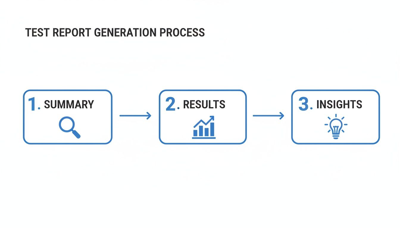
This structure makes sure everyone can quickly grasp the overall status before deciding if they need to dive deeper.
Elevating Reports with Real-World Data
Standard automated tests are great, but they have a blind spot: they often run on clean, predictable data. They’ll tell you if a feature works in a perfect lab scenario, but they can’t always predict how it will hold up against the chaos of real user behavior. This is where you can enrich your automated reports with a dose of reality.
Tools like GoReplay let you capture production traffic and replay it in your testing environment. When you integrate this into your automated workflow, your reports suddenly become much more powerful. Instead of just showing a pass/fail status on scripted tests, they can now include performance metrics based on actual user loads.
By replaying real traffic, you generate reports that provide undeniable proof of how your application handles real-world conditions before a release goes live. Your automated reports can now answer much tougher questions, like: “Did this new feature introduce a performance bottleneck under peak load?” or “Are we seeing more errors with this build when processing complex user requests?” This level of insight transforms your reporting from a simple quality check into a genuine risk assessment tool.
Looking Beyond Pass/Fail to Interpret Key Metrics
Data without context is just noise. A test report that only shows a pass/fail count tells you what happened, but it doesn’t explain why or what it really means for your project. To turn your reports into a powerful diagnostic tool, you have to look past the surface and dig into the metrics that tell the true story of your software’s quality.
Think of these metrics as a health check for your entire development process. They help you spot hidden weaknesses, measure the effectiveness of your QA strategy, and make smart, data-driven decisions about where to focus your energy. Moving beyond simple counts is a must for any team that’s serious about continuous improvement.
Defect Density: Uncovering Code Hotspots
One of the most revealing metrics is Defect Density. This KPI measures the number of confirmed bugs found in a specific module or area of your code, usually calculated per thousand lines of code (KLOC). It’s like a quality heatmap for your application.
A high defect density in one feature doesn’t just mean it’s buggy—it often signals a deeper problem. It could point to overly complex code, fuzzy requirements, or even a developer who might need more support. By tracking this, you can proactively identify high-risk “hotspots” that need refactoring or more intense testing down the road.
- How to Calculate It: (Total Number of Defects / Size of the Code Module)
- What It Reveals: Pinpoints the most fragile and error-prone parts of your application.
- Actionable Insight: If a new feature consistently shows high density, it might trigger a code review or a conversation about architectural complexity.
Defect Leakage: Measuring Your QA Safety Net
How good is your testing process at catching bugs before they escape to your customers? That’s the question Defect Leakage answers. This metric calculates the percentage of defects that were missed during a testing phase and later discovered by end-users in production.
A low defect leakage rate is a fantastic sign of a healthy, robust QA process. On the other hand, a rising leakage rate is a massive red flag. It tells you that your testing safety net has holes and isn’t catching what it should. This could be due to poor test coverage, environment mismatches, or tests that just don’t reflect how people actually use your software.
Defect Leakage is the ultimate report card for your QA team. It measures what matters most: preventing issues from wrecking the customer experience. A rising leakage rate is a clear signal that your current testing strategy needs a serious review.
Tracking this metric helps you justify investments in better testing tools, environments, or training. It draws a straight line between the quality of your testing and the quality of the user experience—a connection every stakeholder can understand. For a deeper dive, check out our guide on essential metrics for software testing.
Test Coverage: Answering “Are We Testing Enough?”
Test Coverage measures how much of your application’s source code has actually been run through your tests. It’s usually shown as a percentage and answers the fundamental question: “How much of our software are our tests actually checking?” Low coverage means huge parts of your application are flying blind, with no automated checks to validate their behavior.
While gunning for 100% coverage can be unrealistic, tracking this metric helps you find critical gaps in your test suite. For instance, if a high-risk feature like a payment gateway has low test coverage, you know exactly where to direct your test-writing efforts.
- Requirements Coverage: Makes sure every business requirement has at least one test case tied to it.
- Code Coverage: Measures which lines, branches, or functions of the code are executed during automated tests.
Interpreting this metric requires context. High coverage doesn’t automatically mean high quality, but low coverage in critical areas is a guaranteed risk. By analyzing these advanced KPIs, your reports in software testing transform from simple scorecards into strategic roadmaps for improving both your product and your process.
Enriching Reports with Real-World Traffic Replay

Your standard automated tests are great for what they do. They run in a clean, controlled lab setting and confirm your code works as designed under perfectly predictable conditions. But they have a huge blind spot—they can’t possibly mimic the messy, unpredictable, and downright chaotic nature of real users.
That gap between tidy, scripted scenarios and messy, real-world behavior is exactly where the nastiest performance bugs and weirdest edge-case issues love to hide. So how do you prove your app is ready for prime time? You stop guessing and start testing with real production traffic.
Moving from Simulation to Reality
This is where replay-based testing comes in. It’s a powerful technique where you capture live user traffic from your production environment and replay it against a staging or test version of your application. Think of it like creating a perfect digital twin of your production workload—every single API call, user request, and oddball interaction—and unleashing it in a safe, contained space.
This method is the ultimate reality check for your software. Instead of trying to simulate how your application might perform under pressure, you test it against the actual pressure it will face on day one.
The most convincing reports in software testing are backed by real-world evidence. Replaying production traffic lets you stop saying ‘it passed the test’ and start proving ‘it can handle our customers.’ That’s how you give stakeholders undeniable confidence before a release.
Tools like GoReplay are built for exactly this purpose. When you bring traffic replay into your workflow, your reports gain a level of depth and accuracy that standard tests just can’t match.
What Replay-Based Reports Can Reveal
Once you start running tests with replayed traffic, your reports transform. They’re no longer just simple pass/fail checklists. They become rich performance dossiers that show exactly how your application behaves under authentic stress, revealing the kinds of problems traditional testing usually misses.
These enriched reports can put a spotlight on critical performance indicators:
- Latency Under Load: See the exact response time for key endpoints when hammered with real concurrent user traffic, not just a few simulated users.
- Error Rate Spikes: Pinpoint which specific user actions or request patterns cause a jump in server errors (5xx) or client errors (4xx).
- Resource Consumption: Watch how CPU and memory usage ebbs and flows with actual traffic, helping you find memory leaks or inefficient code that only shows up under sustained load.
- Performance Regressions: Run the exact same traffic replay against a new build and a baseline. This gives you a true, apples-to-apples comparison to catch any performance slowdowns.
The GoReplay Pro dashboard below is a great example of how this data can be visualized, giving you a crystal-clear comparison of performance metrics between a candidate build and production.
A visual like this makes it dead simple to spot a regression in latency or an uptick in errors. It turns mountains of complex performance data into insights your team can act on immediately.
Integrating Replay into Your CI/CD Reporting
The real magic happens when you bake this approach right into your automated CI/CD pipeline. As soon as a new build is deployed to a staging environment, a job kicks off a traffic replay session. The results—latency, error rates, resource usage—are automatically pulled into the test summary report. To really dig into this, you can learn more about how traffic replay improves load testing accuracy.
What this means is that every single build gets automatically battle-tested against a realistic load. Your developers get instant, high-fidelity feedback on how their changes impact performance. The final report is no longer just a functional checklist; it’s comprehensive proof of production readiness, backed by data that reflects how your customers actually use your software. This is how you build software that doesn’t just work, but holds up.
So, What’s the Difference Between a Test Report and a Test Plan?
Think of a test plan as the architect’s blueprint for a building. It’s drawn up before any construction starts, detailing the entire strategy: what you’re going to build (scope), what materials you’ll need (resources), and the construction schedule. It’s all about foresight and preparation.
A test report, on the other hand, is the final inspection summary written after the building is finished. It documents what actually happened during construction, highlights any issues found, and gives a final verdict on the structure’s quality.
One is the map for the journey; the other is the story of where you ended up.
How Often Should We Be Generating These Reports?
There’s no magic number here—the right frequency depends entirely on how your team works. It’s all about matching the reporting cadence to your development rhythm.
Here are a few common approaches:
- Agile Teams: For teams working in sprints, it’s standard practice to generate a summary report at the end of each one. This gives everyone a clean snapshot of quality for that specific chunk of work.
- Waterfall Projects: In more traditional models, reports usually come after major testing phases wrap up, like system testing or the final user acceptance testing (UAT).
- CI/CD Pipelines: In a fast-moving CI/CD world, you get a flood of detailed execution reports with every single build. To make sense of it all, teams often compile higher-level summary reports daily or weekly to spot trends and keep an eye on the bigger picture.
How Can AI Actually Help with Test Reporting?
Artificial intelligence is already shifting test reporting from a static, after-the-fact chore to a source of dynamic, predictive intelligence. Instead of just documenting what happened, AI helps you understand why it happened and what might happen next.
AI can automatically crunch massive amounts of test data to flag critical trends, predict which parts of the code are most at risk for future bugs, and even write up plain-English summaries of complex test outcomes.
Even better, some AI-powered tools can perform self-healing tests. When a test script breaks due to a minor UI change, the AI can often fix it on the fly and document the change automatically. This keeps your reports accurate and frees up your QA team from endless, soul-crushing maintenance.
Ready to enrich your reports with real-world traffic? GoReplay helps you move beyond simulated tests by capturing and replaying production traffic, providing undeniable proof of your application’s performance. Start testing with real traffic today.