Mastering Reporting in Software Testing for Clearer Insights

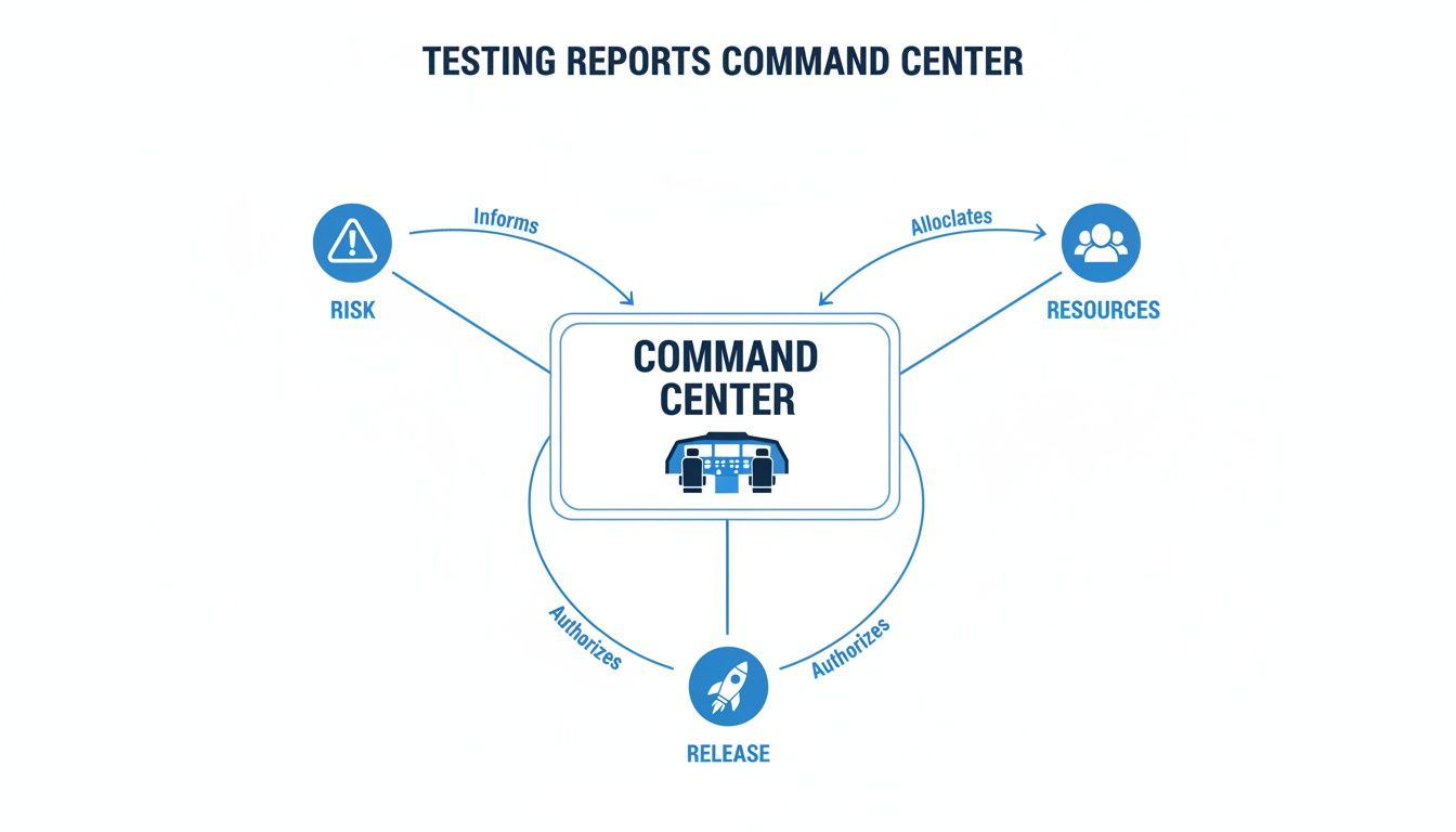
Think of reporting in software testing as your project’s command center. It’s the process of gathering up all the testing activities, results, and analysis to give stakeholders a clear picture of the application’s health and readiness.
These reports are what turn a mountain of complex technical data into actionable insights, helping everyone make smarter, data-driven decisions about the project’s progress, potential risks, and go-live dates. It’s the primary communication bridge connecting the QA, development, and business worlds.
Why Reporting Is Your Project’s Command Center
Picture an airplane cockpit. It’s a sea of instruments, gauges, and screens, each one feeding the pilots critical, real-time data. They don’t have to guess their altitude, speed, or fuel levels—they know exactly where they stand. Flying safely would be impossible without that constant flow of information.
Effective reporting in software testing does the exact same thing for your project. It gives you total visibility and control.
These reports take raw, technical test data and translate it into a language everyone can understand, bridging the gap between deep-in-the-weeds developers and results-focused business stakeholders. A good report doesn’t just list bugs; it tells a compelling story about the application’s health.
From Finding Bugs to Making Decisions
The real power of reporting isn’t just about documenting what you tested. Its strategic value comes from enabling sharp, proactive decisions throughout the entire software development lifecycle (SDLC). When done right, these reports deliver the intelligence needed to manage resources, head off risks, and confidently decide when you’re ready to ship.
A well-structured report helps you nail the answers to the questions that really matter:
- Risk Assessment: Which parts of the app are the most unstable? Where should we point our debugging efforts before the next sprint kicks off?
- Resource Allocation: Does the QA team have what they need to hit the deadline, or do we need to reshuffle priorities?
- Release Readiness: Looking at the defect trends and test coverage, are we truly ready to push this build to production?
By turning test data into clear narratives, reporting helps teams break out of a reactive “bug-hunting” cycle. It builds a proactive culture of quality where data guides strategy and ensures everyone—from developers to executives—is working with the same unbiased intelligence.
Ultimately, reporting is about more than just numbers on a page. It’s about delivering the clarity and confidence required to navigate the messy reality of software development. Just as a pilot trusts their instruments to land a plane safely, project teams rely on these reports to guide their project to a successful launch.
Understanding the Different Types of Software Testing Reports
Not all stories get told the same way, and the same goes for reporting in software testing. Think of each report as a unique communication tool, built to deliver a specific message to a specific audience. When you stop seeing them as just technical lists, you can start choosing the right format to actually drive action.
Instead of a one-size-fits-all document, treat each report as its own information channel. A Test Execution Report is like a daily dispatch from the front lines. A Defect Report? That’s a detailed forensic analysis of a single problem. Each one plays a unique role in the project’s command center.
This is how all these different reports feed into the central decision-making process, directly influencing calls on project risk, where to put resources, and when it’s safe to release.
As you can see, good reporting is the nervous system of a project. It translates raw test data into the critical intelligence needed to make the right strategic calls.
To help you choose the right tool for the job, here’s a quick comparison of the most common report types you’ll encounter.
Comparison of Key Software Testing Report Types
This table breaks down the primary types of testing reports, showing you exactly who they’re for, what they do, and what crucial question they help answer.
| Report Type | Primary Purpose | Typical Audience | Key Question Answered |
|---|---|---|---|
| Test Execution | Provides a real-time status update on test runs | QA Team, Developers, Test Leads | ”Where do we stand right now?” |
| Defect/Bug | Details a single, reproducible software issue | Testers, Developers | ”What is the exact problem and how can I fix it?” |
| Test Coverage | Maps completed tests back to project requirements | Project Managers, Product Owners | ”How much of the application have we actually tested?” |
| Performance | Measures application speed, stability, and scalability | DevOps Engineers, Architects, Business Stakeholders | ”Can our system handle real-world user load?” |
| Release Readiness | Summarizes overall quality to support a release decision | Senior Management, Stakeholders | ”Are we confident enough to go live?” |
Each report tells a different part of the quality story, giving specific teams the exact information they need to move forward. Let’s look at each one more closely.
Test Execution Reports
A Test Execution Report gives you a real-time snapshot of testing progress. It’s your most immediate form of feedback, showing which tests were run, what passed, what failed, and what was blocked during a specific cycle—like a daily standup or a sprint.
This report is mainly for the QA team, developers, and test leads. It’s built to answer one urgent question: “Where do we stand right now?” It helps the team spot new issues the moment they appear, identify environmental problems (like a broken test server), and shift daily priorities on the fly.
Defect or Bug Reports
The Defect Report is arguably the most fundamental piece of paper (or digital ticket) in the entire testing world. In the fast-paced world of software development, bug reports are the cornerstone for teams trying to ship flawless applications. Industry data shows that 47% of testers rely on them as their primary tool for tracking and communicating defects. You can dive deeper into these and other software testing trends and statistics.
Unlike a summary, a bug report zooms in on a single issue with microscopic detail. A good one always includes:
- A clear, concise summary of the problem.
- Step-by-step instructions to reproduce the bug every single time.
- Details about the test environment (browser, OS, device).
- Evidence, like screenshots, logs, or even a quick video.
This report is the direct line of communication between a tester and a developer. A well-written one cuts out all the guesswork and gives a developer everything they need to find the root cause and fix the problem, fast.
Test Coverage Reports
A Test Coverage Report tackles a critical strategic question: “How much of our application have we actually tested?” It works by mapping your test cases back to the project’s requirements or user stories, showing which features have been validated and—more importantly—which ones have been missed.
This report is absolutely essential for project managers and product owners who are responsible for assessing risk. If you see low test coverage in a critical part of the app, that’s a massive red flag before a release. It gives them the hard data they need to make an informed call about whether more testing is needed before going live.
A Test Coverage Report is your quality map. It shows you the territories you’ve explored thoroughly and the uncharted areas that might be hiding dragons (or critical bugs).
Performance Reports
When speed, stability, and scalability are what count, the Performance Report takes center stage. This document details how the application holds up under various levels of stress and load. It isn’t looking for functional bugs; it’s measuring key performance indicators that directly impact user experience.
Key metrics you’ll always find here include:
- Response Time: How long does a user have to wait for the app to react?
- Throughput: How many transactions can the system handle per second?
- Resource Utilization: How much CPU, memory, and network bandwidth is the app eating up?
This report is vital for DevOps engineers, architects, and business stakeholders who worry about user experience and infrastructure costs. It’s their tool for hunting down performance bottlenecks and ensuring the application won’t fall over when real-world traffic hits.
Release Readiness Reports
Finally, we have the Release Readiness Report. This is the ultimate summary document, the one that pulls information from all the other reports to give a final verdict: is the software ready for production? Think of it as the final pre-flight check before takeoff.
This is a high-level report created for senior management, product owners, and other key stakeholders. It boils down all the complex data on test execution, outstanding critical defects, test coverage, and performance into a clear recommendation: Go or No-Go. By presenting a complete, holistic view of the product’s quality, it empowers leaders to make that final release decision with confidence.
Tracking QA Metrics That Actually Drive Improvement

Just counting how many tests you run is like judging a chef by the number of dishes they make, not how they taste. Real, meaningful reporting in software testing cuts through these surface-level “vanity metrics” and gets to the heart of what matters: Key Performance Indicators (KPIs) that tell you the true story of your code quality and testing process.
These numbers aren’t just for show. They reveal bottlenecks, track team efficiency, and prove the tangible value of QA to the rest of the business. When you track the right metrics, raw data transforms into a strategic compass, pointing your project toward a higher standard of quality.
Moving Beyond Simple Pass and Fail Counts
It’s easy to get fixated on the pass/fail rate, but this number can be dangerously misleading. A 95% pass rate sounds great, right? But what if the failing 5% are all located in your critical payment processing module? Suddenly, that impressive figure doesn’t feel so comforting.
Genuine insight comes from metrics that offer context and flag real-world risks. Let’s dive into the KPIs that actually matter—the ones that help you answer the tough questions about your product and your process.
Core Metrics for Code Quality
Think of these metrics as a direct health check for your codebase. If these numbers start trending in the wrong direction, it’s often an early warning sign of deeper issues that the development team needs to address.
-
Defect Density: This KPI measures the number of confirmed defects per unit of code, like defects per 1,000 lines of code. It’s a quality score for a specific feature or module. High defect density in a new component might signal overly complex code or a rush job that needs refactoring.
-
Defect Leakage: This is the ultimate test of your QA safety net. It calculates the percentage of defects your team missed that were later found by actual users in production. A high leakage rate is a massive red flag, pointing to blind spots or a lack of depth in your testing strategy.
Defect Leakage is the metric that keeps product owners up at night. It’s the most direct link between your testing efforts and the real-world customer experience. Every leaked defect represents a moment of user frustration and a potential blow to your brand’s reputation.
Getting this number down is a core goal for any serious QA team. It’s definitive proof that testing is catching problems before they can impact your customers.
Metrics for Team Efficiency and Process Health
While code quality is king, the efficiency of your entire development and testing pipeline is just as critical. These metrics help you spot and eliminate the bottlenecks slowing down your release cycle. For a deeper look, check out our complete guide to essential metrics for software testing that can truly level up your QA strategy.
-
Mean Time to Resolution (MTTR): This measures the average time from when a bug is reported to when it’s fixed, verified, and closed. A long MTTR could point to communication gaps between QA and dev, a convoluted bug-fixing process, or a development team drowning in technical debt.
-
Test Case Effectiveness: What percentage of your test cases have actually found a bug? If you run 1,000 tests but only 20 of them have ever caught anything, it might be time to review and retire some dead weight. This metric ensures your efforts are focused where they provide the most value, not wasted on tests that just go through the motions.
-
Requirements Coverage: This metric asks a simple but vital question: “Are we testing what the customer actually asked for?” It tracks the percentage of business requirements that have corresponding test cases. Low coverage here is a huge risk, signaling you might be about to ship a product that completely misses the mark.
Putting It All Together in Your Reports
Tracking these KPIs is only half the job. To drive real change, you have to present them in a way that’s easy to understand and act on. Your software testing reports should use clear charts and graphs to visualize these metrics and show trends over time.
A line chart showing a steady drop in MTTR over several sprints is a powerful way to demonstrate process improvements to management. Likewise, a bar chart comparing Defect Density across different parts of your application helps developers know exactly where to focus their refactoring efforts.
By focusing on these actionable KPIs, your reporting shifts from a simple bookkeeping chore into a powerful engine for continuous improvement. You’re no longer just counting bugs—you’re strategically engineering quality.
Automating Your Reporting with Modern Testing Tools
Trying to create reports manually in today’s fast-paced development cycles is like trying to keep up with a race car on a bicycle. It’s slow, exhausting, and you’re guaranteed to fall behind.
Manual data collection is a massive bottleneck. It’s riddled with human error and is simply too sluggish for teams pushing code multiple times a day. This is where automation flips reporting in software testing from a painful chore into a real strategic advantage.
When you build an automated reporting pipeline, you get test results gathered, processed, and delivered to stakeholders in real-time. This isn’t just about saving a few hours; it’s about making faster, smarter decisions with the most current data you can possibly get.
Building Your Automated Reporting Pipeline
The secret to automated reporting is plugging your testing tools directly into your Continuous Integration/Continuous Deployment (CI/CD) pipeline. The moment a developer commits new code, the CI/CD server kicks off a whole chain of builds and tests automatically. Each test run spits out a ton of data—pass/fail results, execution times, performance metrics—that can be captured on the fly.
Modern test management platforms are built to play nicely with CI/CD tools like Jenkins, GitLab CI, or GitHub Actions. As tests finish, these systems grab the data and instantly update dynamic dashboards. This creates a single source of truth where anyone, from a QA engineer to a product owner, can see the health of the latest build without nagging someone for a manual report.
This isn’t some niche trend anymore; it’s how modern teams work. The global test automation market is set to hit $49.9 billion by 2025, a huge leap from $15.87 billion in 2019. This growth is fueled by the 77% of companies already using automated tools, which require equally automated reporting to be truly effective. You can learn more about the impact of test automation adoption and how it’s reshaping QA.
Advanced Insights with Traffic-Replay Tools
Standard test automation gives you critical data, but its reports are usually based on clean, pre-scripted scenarios. These tests answer the question, “Does our app work under expected conditions?”
But what about the messy, chaotic, and unpredictable reality of real users? This is where traffic-replay tools like GoReplay change the game.
Traffic replay takes a much more authentic approach. Instead of guessing how users might act, these tools capture actual production traffic—every click, query, and interaction—and then replay it in a staging environment.
It’s the difference between practicing in an empty stadium and playing in the championship game. The reports you get reflect how your application holds up under real-world stress, not just a simulation.
How GoReplay Elevates Your Reporting
Tools like GoReplay completely transform performance reporting by delivering insights that synthetic data could never provide. By capturing and replaying live user traffic, you can generate reports that show exactly how your system behaves when hit with genuine user patterns, concurrency, and request complexity.
This process gives you incredibly valuable data for your performance reports:
- Realistic Bottleneck Detection: Pinpoint the exact API endpoints or database queries that buckle under authentic, high-volume traffic.
- Accurate Capacity Planning: Find out your system’s true limits by hitting it with peak traffic loads captured from your busiest hours.
- Pre-Release Confidence: Replay production traffic against new code to prove that a new feature or bug fix doesn’t secretly tank performance.
By integrating traffic replay into your automated pipeline, your reports become a powerful weapon for proactive performance management. The data doesn’t just show if the system works—it shows how resilient it is against the true behavior of your audience. This level of automation gives you deeper, more accurate intelligence, turning your reporting process into a critical asset for making smart, proactive decisions.
Creating Test Reports That People Will Actually Read

Let’s be honest. Even the most detailed report is completely useless if no one reads it. A dense document packed with raw numbers and technical jargon is more likely to get archived than acted on. The real challenge in reporting in software testing isn’t just collecting data—it’s presenting that data in a way that grabs attention and actually drives action.
Think of yourself less as a data collector and more as a storyteller. Your job is to turn a spreadsheet of pass/fail results into a clear narrative about the product’s health and readiness. To do that, you have to focus on clarity, context, and a clear call to action.
Know Your Audience and Speak Their Language
A report’s success comes down to how well it connects with its audience. A C-level executive needs a completely different set of information than a front-end developer. If you try to create a one-size-fits-all report, you’re setting yourself up for failure.
- For Leadership (Executives, Product Owners): They need the big picture, and they need it fast. Lead with a high-level executive summary. Use simple visuals like pie charts and trend lines to show key takeaways, risks, and overall release readiness.
- For Technical Teams (Developers, QA Engineers): They need the gritty details. Link directly to bug tickets, provide environment specs, and include logs or stack traces. Their job is to diagnose and fix things, so your report must give them a clear starting point.
When you tailor the content, you make sure your message lands and provides immediate value to everyone who reads it.
Use Data Visualization to Tell a Story
People are visual. We process images and patterns way faster than we can read rows of text or numbers. This is why data visualization is your most powerful tool for making complex information easy to digest and remember.
Instead of just stating “75 tests passed and 25 failed,” show a pie chart that instantly communicates the 75/25 split. Don’t just list defect counts from the last four sprints; display a line graph that reveals the trend. This simple shift turns abstract numbers into a story anyone can understand at a glance.
A well-designed chart is more than just a picture; it’s an argument. It should guide the reader to a specific conclusion without them needing to decipher a complex table. The goal is to make the key insights jump off the page.
Answer the “So What?” Question
This is the absolute most critical part of any good report. For every single metric and chart you share, you must answer the unspoken question: “So what does this mean for the project?” Just presenting data isn’t enough. You have to provide analysis, context, and actionable recommendations.
- Data: “Defect density increased by 15% in the new payment module.”
- Analysis (The “So What?”): “This flags a potential quality risk in a critical, revenue-generating part of the application.”
- Recommendation (The “Now What?”): “We recommend dedicating more developer resources to refactor this module and boost test coverage before we go live.”
The software testing market is expected to hit $109.5 billion by 2027, and effective reporting is the glue that holds complex projects together. With 73% of organizations using a mix of manual and automated testing, clear insights are more valuable than ever. Challenges like insufficient testing time (55%) make it vital for reports to be direct and to the point.
Always connect your data to real business outcomes. When you do, your reports transform from passive data dumps into strategic tools that guide decisions and actively improve the final product. Building an effective software quality metrics dashboard is a great way to start visualizing this data effectively.
Common Questions About Software Test Reporting
Even with a solid game plan, questions always come up when you start building out your reporting in software testing. It’s a discipline with a lot of moving parts, where the “right” answer usually depends on your team’s specific tools, workflow, and goals.
Getting ahead of these common hurdles can save you a ton of time and confusion down the road. Let’s tackle the questions QA pros and managers run into most often.
How Often Should I Generate Test Reports?
There’s no magic number here. The best reporting frequency depends entirely on the report’s purpose and who’s reading it. A good rule of thumb is to sync your reporting cadence with the rhythm of your development cycle.
- Daily Reports: These are perfect for Test Execution Reports during an active sprint. They give the dev and QA teams an immediate pulse check on progress and help them jump on new blockers the moment they appear.
- Per-Sprint or Per-Cycle Reports: When a sprint or a major testing cycle wraps up, you need a more comprehensive summary. This is the ideal time to generate a Test Coverage or an interim Defect Summary Report for project managers and product owners.
- On-Demand Reports: Sometimes a stakeholder needs an update right now before a big meeting or a release decision. Your tooling should be flexible enough to spit out these ad-hoc reports in a pinch.
- Release-Based Reports: The big one—the final Release Readiness Report—is obviously generated just once per release. It’s the capstone document that informs the final go/no-go decision.
What Is the Difference Between a Test Report and a Bug Report?
This trips people up all the time, but the distinction is critical. It all comes down to scope. A bug report is a close-up on a single problem, while a test report is the wide-angle shot of the entire testing effort.
A bug report is a detailed police file on a single suspect—complete with evidence, location, and steps to reproduce the crime. A test report is the chief’s city-wide crime statistics dashboard, showing trends, hotspots, and overall public safety.
Think of it this way: a Bug Report is a tactical, granular document. It’s written by a tester to give a developer every last piece of information they need to fix one specific issue.
A Test Report, on the other hand, is a strategic, high-level summary. It pulls together data from hundreds of test runs and dozens of bug reports to paint a picture of the application’s overall health for a much broader audience.
How Can I Make Sure My Reports Are Not Ignored?
If your reports are gathering digital dust, they’re probably failing in one of three areas: relevance, clarity, or actionability. Getting people to actually read what you create comes down to mastering these three things.
First, know your audience. An executive doesn’t need to see the stack trace for a minor UI glitch. Give them the 30,000-foot view with key risk indicators. A developer, however, needs exactly that level of detail to do their job. Tailor the content.
Second, make it visual. A clear trend line in a graph is way more powerful than a spreadsheet full of numbers. Use charts, colors, and callouts to draw the reader’s eye straight to the most important insights.
Finally, every single report must answer the “so what?” question. Don’t just dump data—interpret it. Follow up your findings with a brief analysis and clear, actionable recommendations. Instead of just saying, “There are 15 critical bugs,” try this: “15 critical bugs remain in the payment module. We recommend delaying the release by one week to resolve them.” That single sentence transforms your report from a simple status update into a vital decision-making tool nobody can afford to ignore.
Ready to revolutionize your performance testing reports with real-world data? GoReplay captures and replays your live production traffic, giving you unparalleled insights that synthetic tests can’t match. Ensure your application is ready for anything by testing with reality. Discover how you can build more resilient systems by visiting https://goreplay.org.