Why Most Performance Dashboards Are Digital Disasters

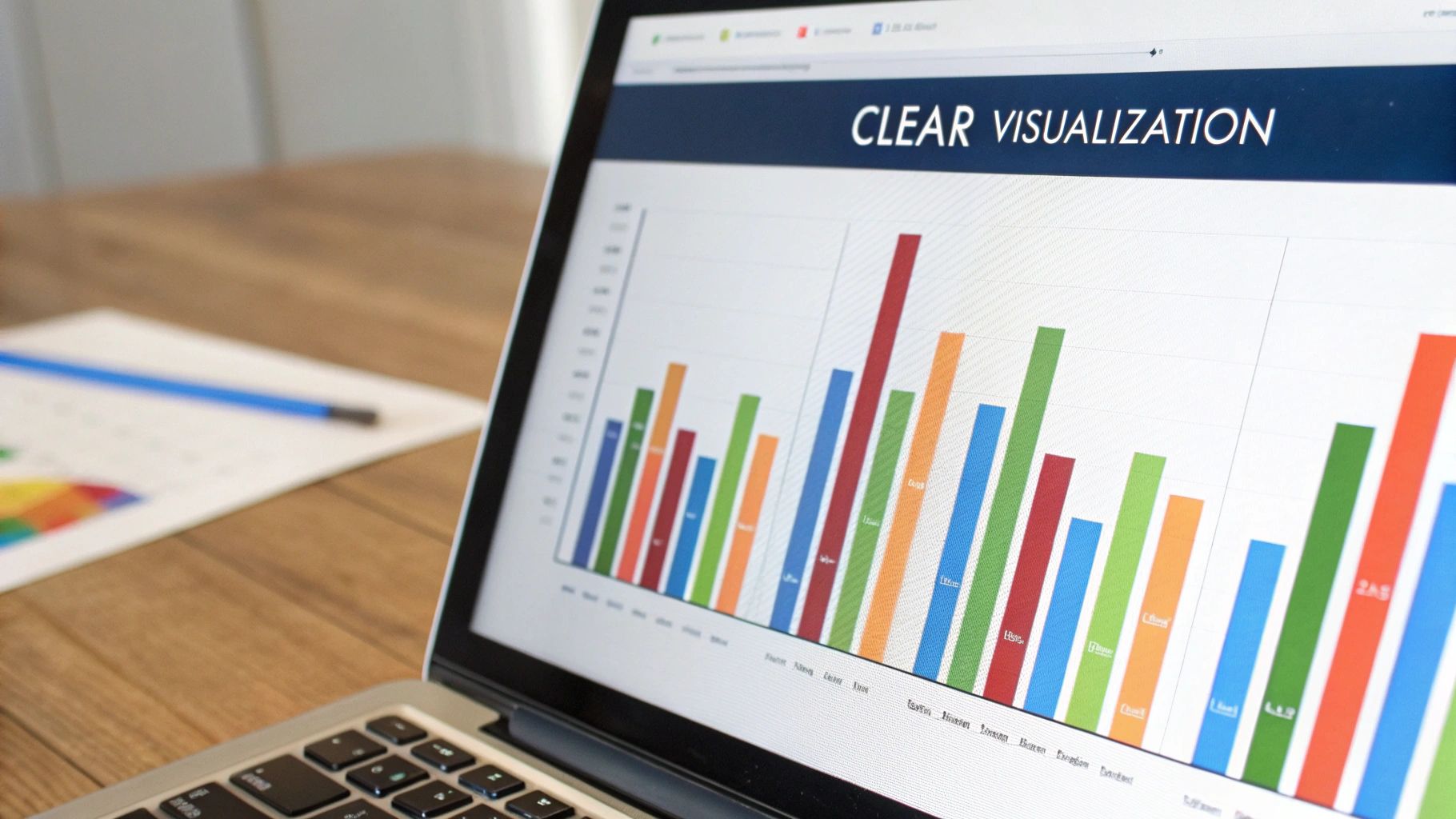
This screenshot shows a sample performance dashboard, visualizing key metrics. Even here, you can see the potential for information overload if the design isn’t carefully considered. A good performance dashboard doesn’t just show data; it tells a story. Let’s face it: many dashboards become neglected spreadsheets, gathering digital dust. Studies suggest a shocking 80% are abandoned within six months. Why this graveyard of well-intentioned data?
The Data Deluge and Vanity Metrics
One problem is the sheer volume of data. Imagine drinking from a firehose—that’s what it’s like trying to use an overcrowded dashboard. Instead of clarity, these dashboards drown users in irrelevant information. This often comes from focusing on vanity metrics—numbers that look impressive but don’t offer useful insights.
For example, millions of website visits mean little if they don’t lead to conversions or engagement. It’s like celebrating a packed stadium without knowing if anyone bought tickets.
Lost in the Visuals
Another trap is prioritizing flashy visuals over clear communication. A beautiful chart is useless if it doesn’t convey a message. It’s like a stunningly illustrated book without a plot.
Dashboards should guide users through a narrative, revealing trends and insights that prompt action. They need to answer the “so what?” question, turning raw data into actionable intelligence. Think of a GPS navigation system—it doesn’t just show a map; it guides you with clear directions.
From Data Dump to Trusted Advisor
The key to a successful dashboard is a change in thinking. Instead of just showing all the data, focus on telling the right story. This means prioritizing relevant metrics, creating intuitive layouts, and focusing on actionable insights.
The goal is a dashboard that feels like a trusted advisor, not a data dump. This advisor should highlight key performance indicators (KPIs) relevant to specific business goals, letting users make informed decisions quickly and effectively. It’s about empowering users to understand their data and find real value in it.
The Psychology of Dashboard Design That Drives Action
Creating truly engaging performance dashboards isn’t about cramming in every single data point. It’s about understanding how people absorb information, especially when they’re under pressure. Think of a pilot trying to land a plane while staring at a cockpit overflowing with dials and gauges – overwhelming, right? The same idea applies to dashboards.
We need to design dashboards that make information clear and accessible at a glance.
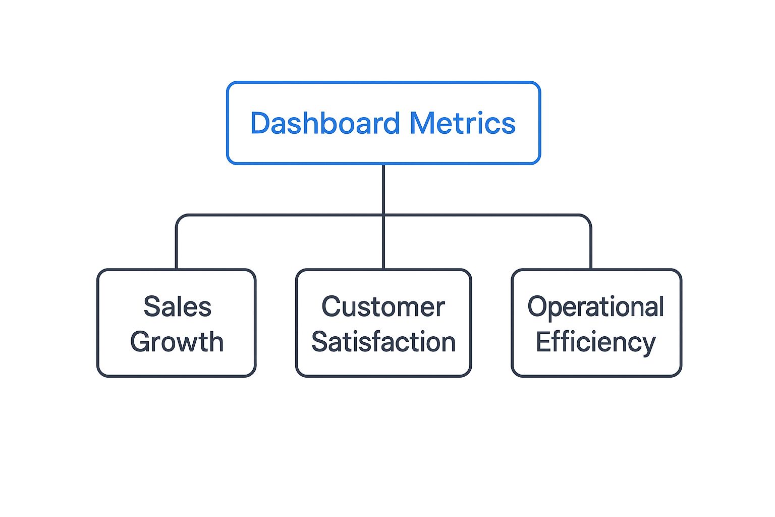
This infographic shows a common hierarchy for dashboard metrics. Notice how it starts with a broad overview and then gradually drills down into specific areas. This logical structure is key to an effective dashboard. It allows users to quickly grasp the big picture and then explore details as needed.
The Five-Second Rule and Cognitive Load
Effective dashboards follow the five-second rule. This means a user should be able to understand the main takeaways within five seconds of looking at the dashboard. Achieving this requires minimizing cognitive load, or the mental effort needed to process information. Just like a cluttered desk makes it harder to focus, a cluttered dashboard makes it harder to understand the data.
Using visual cues, like color-coding and white space, can help direct attention to the most important metrics. This allows users to quickly spot areas needing attention without getting lost in the details.
This screenshot from Tableau shows this in action. The key metrics stand out, while supporting data is readily available but not distracting. This design allows for both quick checks and deeper dives into the data.
To further illustrate best practices and common pitfalls, let’s take a look at the following table. It breaks down how specific design choices impact the user experience.
| Design Principle | Best Practice | Common Mistake | Impact on Users |
|---|---|---|---|
| Visual Hierarchy | Emphasize key metrics with size and color | Using uniform sizing and coloring for all data points | Difficulty quickly identifying important information |
| Cognitive Load | Minimize the number of elements on the dashboard | Overloading the dashboard with excessive charts and data | Confusion and difficulty focusing on key insights |
| Clarity | Use clear and concise labels and titles | Using jargon or ambiguous language | Misinterpretation of data and incorrect decisions |
| Actionability | Highlight areas requiring attention and suggest next steps | Presenting data without context or recommendations | Passive observation instead of proactive action |
| White Space | Strategically use white space to separate elements and improve readability | Cramming too much information into a small space | Overwhelming and visually unappealing, making it difficult to parse information |
As this table highlights, effective dashboard design prioritizes clarity and actionability, guiding users towards meaningful insights and informed decisions.
Action-Oriented Design
Ultimately, performance dashboards should drive action. They’re not about passively looking at data; they’re about sparking informed decisions. This means presenting data in a way that instantly reveals areas for improvement and opportunities for growth. Think about a car’s dashboard. It not only shows your speed but also alerts you to low fuel or engine problems, prompting you to take action.
This same principle applies to any performance dashboard, whether it’s tracking sales performance or website traffic. By clearly highlighting critical thresholds and deviations from targets, the dashboard becomes a tool for proactive problem-solving and strategic adjustments. A good dashboard caters to both quick overviews and detailed analysis, empowering users to act on the insights they discover.
Essential Components That Make Dashboards Indispensable
Imagine an airplane cockpit. Pilots rely on a collection of instruments – altimeters, airspeed indicators, fuel gauges – to navigate safely. Similarly, businesses need the right tools to steer their operations. Performance dashboards provide those crucial instruments, transforming raw data into actionable insights. Let’s explore the key elements that make them so valuable.
Key Performance Indicators (KPIs) and Their Placement
Think about the most vital signs you’d check on a patient – pulse, blood pressure, temperature. In business, these vital signs are your Key Performance Indicators (KPIs). They need to be front and center, “above the fold” on your dashboard. Just like a doctor needs immediate access to critical patient information, a CEO needs to instantly grasp key metrics like sales revenue or customer churn. This prominent placement provides a quick overview of the business’s overall health.
But dashboards shouldn’t just show snapshots in time. Imagine a stock ticker displaying the current price, but without the historical graph. It wouldn’t tell the whole story, would it? Dashboards need to provide context, showing trends and patterns over time. This historical perspective is essential for informed decision-making.

This screenshot from Microsoft Power BI showcases how different visualizations – charts, graphs, tables – can work together. The variety allows users to see data from multiple angles, while the clear layout prevents information overload. This balance between high-level overviews and granular detail is a hallmark of effective dashboard design.
Smart Alerting and Drill-Down Capabilities
Now, consider a smoke detector. It alerts you to danger, but a faulty one constantly going off is just as bad. Similarly, dashboards need smart alerting. They should notify users of significant changes – but only the ones that truly demand attention. This prevents “alert fatigue” and ensures that critical issues don’t get lost in the noise.
Coupled with smart alerting is the ability to drill down. Imagine a sudden drop in website traffic triggering an alert. Being able to drill down into specific traffic sources – social media, search engines, referrals – provides valuable context. This lets you investigate the “why” behind the “what” and uncover the root cause of anomalies. This functionality is a driving force behind the growth of the dashboard software market, projected to reach $11.75 billion by 2029, up from $6.88 billion in 2025. You can find more details here.
For example, a sudden drop in website traffic might trigger an alert. But the real power comes from being able to drill down and understand why. Is it a specific geographic region? A particular marketing campaign underperforming? This deeper dive empowers you to take targeted action. You might find our guide on boosting application performance through load testing helpful. Effective dashboards blend real-time insights with historical data, giving users the information they need at a glance while also allowing them to explore the details on demand.
Real-Time vs. Historical Data: Getting the Balance Right
Imagine a doctor checking a patient’s vital signs. Blood pressure during surgery needs immediate attention. But cholesterol tracked over months tells a different story – a story of trends and overall health. Performance dashboards work similarly, balancing the urgency of “right now” with the big picture view offered by historical data.
Why Real-Time Matters
Real-time data gives you that immediate snapshot. Picture the frantic energy of a trading floor. Split-second decisions can mean fortunes made or lost. Real-time dashboards show up-to-the-second stock prices, market fluctuations, and order executions. In this environment, a delay can be disastrous.
Emergency response centers offer another great example. They use real-time dashboards to track first responders, monitor unfolding events, and allocate resources. That immediacy is crucial for quick decisions and effective coordination. This same need for instant information applies everywhere from network operations centers watching server performance to e-commerce sites tracking sales and inventory.
The Power of Historical Context
But real-time data is only half the story. Imagine seeing a spike in website traffic. Is it unusual, or just business as usual? Historical data provides that context, revealing the trends and patterns that truly inform smart decisions.
Think of an e-commerce business analyzing sales data over a year. They can spot seasonal buying patterns, predict demand, and manage inventory efficiently. This long-term perspective helps with strategic decisions around marketing, product development, and resource allocation. It’s the difference between reacting to the present and preparing for the future. This need for data-driven decisions is fueling the growth of the real-time dashboard market. Valued at about $12 billion in 2023, it’s projected to reach $32 billion by 2032. Learn more about the real-time dashboard market.
Finding the Right Balance: Practical Frameworks
So how do you find the right mix of real-time and historical data? It’s about understanding which metrics need instant updates and which benefit from trend analysis. Let’s look at a practical comparison:
The following table illustrates how different metrics benefit from different approaches to data presentation. It highlights the need for a tailored strategy when designing your dashboards.
Real-Time vs Historical Dashboard Metrics Comparison Analysis of when to use real-time versus historical data presentation for different business scenarios
| Metric Type | Real-Time Benefits | Historical Benefits | Recommended Approach |
|---|---|---|---|
| Server CPU Usage | Immediately detect performance bottlenecks | Identify long-term usage trends and plan resource allocation | Real-time monitoring with historical trend overlays |
| Website Traffic | Track current visitor activity and identify sudden changes | Analyze traffic patterns over time to optimize marketing campaigns | Real-time overview with drill-down capabilities for historical data |
| Sales Revenue | Monitor current sales performance and identify immediate dips | Track sales growth over time to evaluate the effectiveness of sales strategies | Real-time key metrics with historical comparisons |
| Customer Satisfaction | Address immediate customer issues and feedback | Analyze customer sentiment trends to identify areas for improvement | Real-time alerts for critical feedback combined with historical trend analysis |
As you can see, there’s no one-size-fits-all solution. Effective dashboards blend real-time and historical data, offering both immediate awareness and valuable context. By thinking about the specific needs of each metric and your overall goals, you can build dashboards that empower better decision-making.
Customization That Scales Without Creating Chaos
One-size-fits-all rarely works, especially when we talk about performance dashboards. Imagine a CEO needing a quick overview of company performance sharing the same dashboard as a marketing manager deep-diving into specific campaign metrics. It’s like trying to use the same map for a cross-country road trip and a neighborhood walk – both helpful, but vastly different in scale and detail. Successful organizations recognize the need for personalized dashboards without creating a management nightmare.
Role-Based Views: The Foundation of Scalable Customization
Think of your car’s dashboard. The driver sees speed, fuel level, and essential warnings. The mechanic, on the other hand, plugs into a diagnostic port revealing a wealth of information hidden from the driver. This mirrors the concept of role-based dashboards. Executives get a high-level view highlighting key performance indicators (KPIs), like the company’s overall “speed” and “fuel level.” Operational teams, like our “mechanics,” access the detailed metrics relevant to their specific tasks, such as website traffic or sales conversions. This focused approach delivers the right information to the right people, preventing information overload.
It’s about providing specialized toolkits. A surgeon doesn’t need a plumber’s wrench, just like a marketing manager doesn’t need server performance metrics. Role-based dashboards ensure everyone has the right tools for the job.
User Permissions and Customization Options
Effective customization also involves managing user permissions. Not everyone needs access to every single data point. Controlled access, like a library system, prevents accidental changes and ensures data integrity. Everyone can borrow books (access data), but only librarians can edit the catalog (modify the data source).
Offering customizable elements like widgets, charts, and report layouts empowers users to tailor their view. However, too much freedom can lead to chaos. Imagine a kitchen where everyone rearranges appliances and utensils on a whim – initially exciting, but quickly impractical.
Dashboard Governance: Balancing Flexibility and Consistency
Therefore, establishing dashboard governance is essential. This means creating standards for layout, metrics, and terminology, ensuring consistency across the organization. Think of it as a style guide for writers: it allows for individual expression while maintaining a cohesive overall voice.
This governance provides essential guardrails, allowing for customization within defined parameters. It prevents a “wild west” scenario of incompatible dashboards, ensuring maintainability and interoperability. The growth of the programmable dashboard market (projected to increase from $6,540.3 million in 2025 to $18,012.1 million by 2033) highlights the growing need for adaptable, yet governed, solutions.
The Sweet Spot: Standardization Meets Personalization
The key is finding the balance between standardization and personalization. Too much standardization creates rigid, unhelpful dashboards. Too much personalization leads to management headaches and data inconsistencies. The sweet spot is where users feel empowered without overwhelming support teams or sacrificing data integrity. Think of a well-organized closet – it allows for individual choices within a structured framework.
By establishing clear guidelines, providing training, and regularly reviewing dashboard usage, organizations can ensure their performance dashboards remain valuable, scalable tools. This approach empowers data-driven decisions at all levels, transforming raw data into actionable insights that drive real business success.
GoReplay’s Analytics Approach: Making Testing Data Accessible
Imagine trying to understand rush hour traffic by staring at raw data from thousands of car sensors. A bit overwhelming, right? Software testing is similar. Tons of technical data flows in, but making sense of it can be tough, even for seasoned developers. That’s where GoReplay’s analytics dashboard comes in handy. It turns complex technical data into useful, easy-to-grasp information.
Visualizing the Chaos of Testing
GoReplay’s dashboard acts like a traffic control center, giving a clear, real-time view of your system. Instead of just raw numbers, it presents the information visually. This helps everyone, from developers to business stakeholders, understand the effects of changes and spot potential bottlenecks.
This screenshot from the GoReplay website shows how they capture and replay live traffic. Their clean design mirrors the clear and efficient way their analytics dashboard works. By mimicking real-world traffic, GoReplay lets you see exactly how your system performs under realistic conditions.
From Traffic Replays to Actionable Insights
GoReplay’s dashboard is especially good at showing traffic replay results. Instead of just data points, you see a clear picture of your system’s response to simulated user actions. This helps developers pinpoint performance bottlenecks and see how changes impact the user experience. It’s crucial for optimizing performance and catching problems before they affect real users.
Let’s say you’re testing a new website feature. GoReplay replays recorded user sessions to see how the feature performs under pressure. The dashboard visualizes the results, highlighting any slowdowns or errors. This helps you fine-tune the feature for a smooth launch. For more practical advice, check out our guide on load testing APIs.
Tracking Errors and Measuring Performance
GoReplay’s dashboard is also great for error tracking. Think of it as a detective highlighting clues. Instead of digging through log files, developers see a clear picture of error rates, types, and trends, making it easier to find the root cause and fix problems fast.
The dashboard also helps compare performance. It’s like a stopwatch tracking athletes over time. By providing clear before-and-after comparisons, GoReplay lets developers measure the impact of code changes on important metrics like response times and throughput. This data-driven approach helps developers make smart choices and optimize for peak performance.
Designing for Clarity and Action
GoReplay’s analytics dashboard highlights some important performance dashboard design principles. By prioritizing clear visuals, focusing on useful insights, and making data user-friendly, it helps everyone, technical or not, understand and use testing data. This makes GoReplay a valuable tool for any team focused on delivering high-quality, dependable software.
From Launch to Daily Driver: Implementation That Sticks
Building a successful performance dashboard isn’t just about creating a visually appealing display of charts and graphs. It’s about building a tool that genuinely empowers users to make better decisions. Think of it like constructing a well-designed kitchen: beautiful cabinets are nice, but the real value comes from how effectively it helps you prepare a meal. Similarly, a performance dashboard’s success hinges on a solid implementation plan that considers both technical aspects and the human element.
Gathering Meaningful Requirements
Before diving into development, it’s crucial to understand what information your users actually need. Imagine embarking on a research project: you wouldn’t start gathering data without a clear research question, right? Similarly, gather input from stakeholders across your organization to understand their specific workflow needs and identify the key performance indicators (KPIs) that truly matter. This focused approach prevents creating a dashboard cluttered with irrelevant data, ensuring clarity and usefulness.
Managing Expectations and User Testing
Just like building a house requires constant communication with the client, keeping stakeholders informed throughout the development process is crucial. Regular updates prevent misunderstandings and ensure everyone remains aligned. Conduct thorough user testing with representative users – this is like test-driving a car before buying it, allowing you to uncover any hidden usability issues before they become major problems. Remember, user testing isn’t about showcasing features; it’s about ensuring a smooth and intuitive user experience.
Avoiding Implementation Pitfalls
Many dashboards fail because they’re overly complex, difficult to navigate, or simply don’t provide relevant information. It’s like giving someone a Swiss Army knife when all they need is a simple bottle opener. Prioritize simplicity and focus on delivering actionable insights. Avoid overwhelming users with excessive data or technical jargon. A cluttered dashboard hinders decision-making, just like a messy workspace distracts from productivity.
Measuring ROI and Maintaining Engagement
Don’t just track superficial metrics like the number of dashboard views. Instead, focus on measuring the return on investment (ROI). How is the dashboard influencing business decisions and driving positive outcomes? It’s like evaluating a restaurant not by its ambiance, but by the quality of its food. Are decisions being made more efficiently? Are problems being resolved more effectively? These are the real indicators of success.
Finally, maintaining engagement after launch is essential. Regularly update the dashboard with fresh insights and new features. Provide training and support to help users maximize the tool’s potential. Just as a garden requires ongoing care and attention to flourish, your dashboard needs consistent nurturing to remain a valuable and utilized resource. By following these strategies, you can ensure your performance dashboard becomes an indispensable tool, promoting data-driven decisions and contributing to long-term success.
Ready to transform your testing data into actionable insights? Explore GoReplay and experience the power of a performance dashboard designed for today’s demanding testing environments.