What Software Quality Actually Looks Like In The Real World
Talking about how to measure software quality can quickly get lost in abstract models and academic terms. Let’s cut through that noise. In the real world, quality isn’t a universal standard; it’s a strategic choice shaped entirely by your users, your industry, and your business goals. The concept of “good enough” for a high-frequency trading platform is completely different from that of a free-to-play mobile game.
For a fintech app, quality is all about reliability and security. A single bug in a transaction could cost millions and destroy user trust forever. In this scenario, quality means exhaustive testing, verifiable transaction logs, and an almost zero-tolerance policy for data-related defects. On the other hand, a gaming platform prioritizes performance and user experience. Players might forgive a few minor visual glitches, but consistent frame rate drops will send them straight to a competitor. For them, quality means smooth gameplay and a responsive interface.
The Problem With “Zero Bugs”
Chasing a “zero bug” policy often leads to frustration and missed deadlines. While it sounds great on paper, it’s an unrealistic goal that can halt development. The truth is, not all bugs are created equal. A typo in a settings menu is a low-priority annoyance, but a security flaw exposing user data is a five-alarm fire.
High-performing teams don’t aim for zero bugs; they aim for zero critical issues impacting the user’s primary workflow. This practical approach is far more effective. It frees you up to focus on what really matters instead of getting bogged down by tiny imperfections that have little to no impact on the customer.
Thinking In Multiple Dimensions
Ultimately, measuring software quality isn’t about a single score. It’s like putting together a multi-dimensional puzzle where you have to balance competing characteristics to find the right fit for your product. This chart of software quality characteristics from Wikipedia shows just how many facets there are to consider.
The model illustrates that quality goes way beyond just functionality. It includes maintainability, portability, and efficiency, among other attributes. These dimensions are often linked. For example, highly maintainable code (an internal quality) makes it easier to fix bugs and add features, which directly improves reliability and functionality (external qualities) down the line. If you ignore something like maintainability to rush out new features, it almost always comes back to haunt you, making future development slower and more expensive. Understanding this interplay is the first real step toward a mature quality strategy.
Building Your Quality Measurement Framework That Works
It’s easy to look at established frameworks like Google’s DORA metrics and think you can just plug them into your process. But simply copying what works for someone else often leads to frustration and useless data. A truly effective system for measuring software quality is one that’s adapted to your team’s specific needs. The goal isn’t just to make fancy charts; it’s to build a dashboard that helps your team make smarter decisions every single day.
A great starting point is to balance different kinds of metrics.
Blending Leading and Lagging Indicators
A solid framework balances leading indicators with lagging indicators. Think of leading indicators as your early-warning system—they give you a heads-up about potential problems before they ever reach your users. Some good examples are:
- Code Coverage: The percentage of your codebase that is covered by automated tests.
- PR Maturity: How much code in a pull request gets changed during the review process. A low maturity might signal that work is being rushed.
- Test Automation Rates: The share of your tests that are automated versus those that require manual effort.
On the other side, lagging indicators measure results after the fact. They tell you how your quality efforts are performing out in the wild. Metrics like defect escape rates or customer satisfaction scores (CSAT) fall into this category. A healthy setup uses leading indicators to proactively influence and improve the lagging ones, creating a virtuous cycle of quality.
This chart shows a snapshot of key internal quality metrics: code coverage, defect density, and cyclomatic complexity.
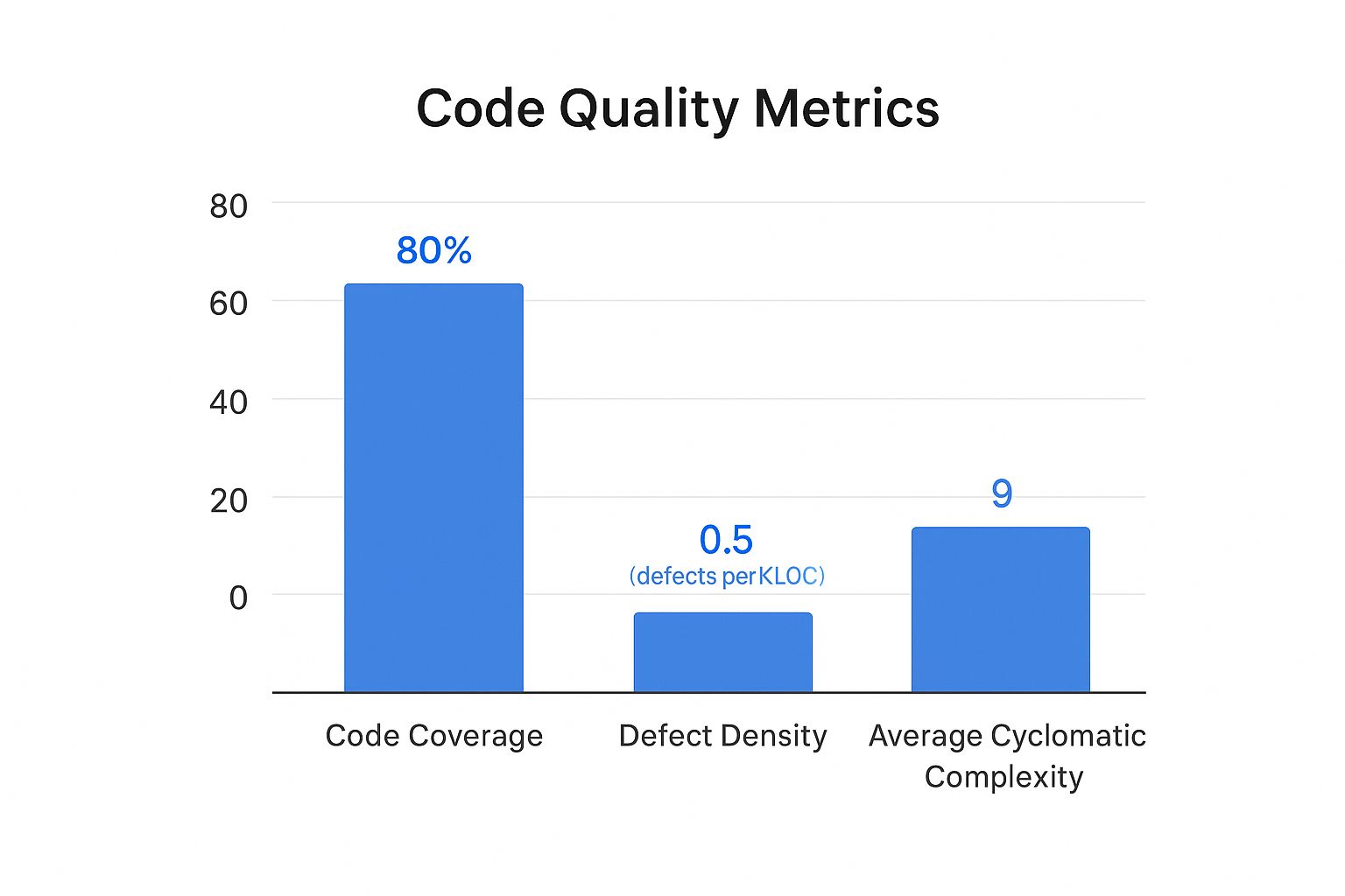
Here, we can see a strong code coverage at 85%. However, the defect density and complexity are relatively high, which suggests that even though tests exist, the underlying code might be too complex and difficult to maintain.
Customizing to Your Context
Your measurement framework has to reflect your team’s size, tech stack, and business goals. A small startup team might obsess over lead time for changes and direct customer feedback. In contrast, a large enterprise handling sensitive financial data will naturally focus more on security vulnerabilities and change failure rate.
To get a better handle on these metrics, here is a quick comparison of some essential software quality metrics that teams often track.
Essential Software Quality Metrics Comparison
A comprehensive comparison of key quality metrics including their purpose, measurement frequency, and ideal targets for different team sizes
| Metric Type | Purpose | Measurement Frequency | Target Range | Best For |
|---|---|---|---|---|
| Code Coverage | Ensures new code is tested | Per Pull Request | > 80% | All Teams |
| Change Failure Rate | Measures the stability of releases | Per Release/Sprint | < 15% for elite teams | Teams focused on stability |
| Lead Time for Changes | Tracks time from commit to deploy | Continuously | < 1 day for elite teams | Startups, agile teams |
| Defect Escape Rate | Measures bugs found in production | Per Release/Quarter | < 5% | Large enterprises, mission-critical systems |
| Customer Satisfaction (CSAT) | Gathers direct user feedback on quality | Monthly/Quarterly | > 75% | All Teams |
This table shows there’s no one-size-fits-all answer. The right metrics for you depend entirely on your team’s priorities, whether that’s rapid delivery, ironclad stability, or something in between.
The growing dependence on specialized tools to manage this process is undeniable. The quality management software market was valued at USD 11.14 billion in 2024 and is projected to climb to USD 20.66 billion by 2030. You can dig into the full market research about quality management software growth on Grand View Research. This massive investment shows a clear global shift toward making quality a measurable, data-driven discipline. By starting with a baseline and setting realistic targets, you can build a framework that truly moves the needle.
Automated Testing Strategies That Actually Deliver Results
Let’s be honest: most test automation efforts don’t fail because of the tools. They fail because of a flawed strategy. A common pitfall is attempting to automate every single thing, which creates a brittle, high-maintenance test suite that breaks with every minor UI change and drags down development speed. The real secret to success is applying the 80/20 rule: focus your automation on the 20% of your application that delivers 80% of the value. This means prioritizing the critical paths your customers depend on daily.

Where to Focus Your Automation Budget
Instead of chasing the vanity metric of 100% test coverage, smart teams invest their limited automation resources with a clear plan. Here’s a practical breakdown of where you’ll get the biggest return on your investment:
- API and Integration Tests: This is the sweet spot. API tests are much faster and more stable than UI tests, and they validate the core business logic where most critical bugs hide. If your API contracts are solid, you’ve already won half the battle.
- Critical User Journeys: Think like your users. Map out the most common paths they take through your application. For an e-commerce site, this would be searching for a product, adding it to the cart, and successfully checking out. Automate these flows from end to end to guarantee your core business functions are always working.
- Regression Testing for Core Features: Once a feature is stable, create a lean set of automated regression tests. Their job is to act as a safety net, catching any new code that accidentally breaks old, reliable functionality.
This focused approach helps you build a resilient test suite that finds real issues without becoming a maintenance nightmare. To learn more, you can explore the game-changing benefits of automated testing in our detailed guide.
The Gradual Shift from Manual to Automated
Transitioning to automation doesn’t have to be a disruptive, all-or-nothing event. The best way to start is by identifying your most repetitive and time-consuming manual tests. These are perfect first candidates for automation. As you automate one area, you free up your manual testers to focus on more complex exploratory testing where human intuition excels—like checking usability or hunting for tricky edge-case bugs. This gradual handover is key for getting team buy-in and avoiding workflow chaos.
This move toward automation is a clear trend across the industry. Around 2025, the global ratio of software testers is about 5.2 per 100,000 people. It’s telling that 30% of developers now prefer automated testing over manual methods, with AI adoption in testing projected to grow by 37.3% between 2023 and 2030. You can discover more insights about current software testing statistics on Global App Testing. By automating intelligently, you not only improve how you measure software quality but also build a more efficient and reliable development process.
Performance And User Experience Metrics That Matter
Beyond the health of your codebase, the ultimate test of software quality is what happens when a real person tries to use your application. Flawless code that delivers a slow, frustrating, or confusing experience isn’t quality software. This is where you have to move past internal metrics and start measuring what your users actually feel. The goal is to blend technical performance indicators with real-world usability to get a complete picture.
Technical Performance as a User Metric
Your users don’t care about your server’s CPU load, but they absolutely care about how fast a page loads. To them, slow performance is just a bug. Key metrics to monitor here are all about speed and reliability from their point of view:
- Load Time: How long does it take for your app’s pages or screens to become usable? Studies consistently show that even a 1-second delay can cause bounce rates to spike.
- Error Rate: What percentage of user requests end in an error, like a 500 or 404 page? This is a direct reflection of how reliable your application feels.
- API Response Time: How quickly does your backend respond to requests? Sluggish API calls are a frequent and often hidden cause of an app feeling slow.
Tools like Google Lighthouse can give you a quick, actionable snapshot of these core web vitals and other important factors.
Here’s an example of a Lighthouse report, which provides scores for Performance, Accessibility, Best Practices, and SEO.
This report shows that while the site is doing great on SEO and Best Practices, the Performance score of 73 means there’s a clear opportunity to improve things in a way that would directly benefit the user experience.
Measuring the True User Experience
Technical numbers only tell part of the story. To really understand software quality from a user’s perspective, you have to watch their behavior. This often requires different tools and a more qualitative approach. For a deeper look into this area, you can check out our guide on the essential metrics for software testing.
Think about tracking these experience-focused indicators:
- Task Completion Rate: For a key workflow, like signing up or making a purchase, what percentage of users who start it actually finish? A low rate is a huge red flag for a design or usability problem.
- User Flow Abandonment: Where exactly in a critical process are users dropping off? Analyzing these abandonment points can highlight specific spots of friction in your UI/UX.
- User Satisfaction (CSAT/NPS): Sometimes, the best way to know what users think is to just ask them. While subjective, direct feedback from surveys is priceless for making sure your quality efforts align with what people truly want.
Integrating Quality Into Your Development Workflow
Truly effective quality measurement isn’t something you bolt on at the end of a sprint; it’s woven into the very fabric of how your team works. High-performing teams don’t see quality as a gatekeeper that slows them down. Instead, they treat it as an accelerator that prevents costly rework and production fires. This means shifting quality checks “left”—as early in the development process as possible.
The core idea is simple: it’s far cheaper and faster to fix a design flaw on a whiteboard or a bug during a code review than it is to fix it after it has been deployed to production. This proactive approach turns quality into everyone’s responsibility, not just a task for the QA team.
Making Quality a Team Sport
A culture of quality starts with everyday practices. Meaningful code reviews are a great example. They shouldn’t just be about spotting typos. A good review asks deeper questions: Does this change introduce unnecessary complexity? Could this logic fail under high load? Does it align with our architectural principles? Research shows that better code review practices directly correlate with fewer post-release defects.
Another powerful technique is pair programming, where two developers work together at one workstation. This practice naturally creates a real-time review process, improving code quality from the first line written and helping share knowledge across the team. These aren’t just feel-good activities; they are deliberate process choices that build quality into the code from the ground up, reducing the rework rate and improving PR maturity.
Building Quality Into Your Pipeline
Beyond individual practices, you need to embed quality checkpoints directly into your delivery pipeline. This is where Continuous Integration (CI) and Continuous Deployment (CD) become your greatest allies. A well-configured CI pipeline automatically runs a suite of tests on every single commit, providing immediate feedback to the developer.
This automation is your first line of defense. It ensures that no change, no matter how small, gets merged without passing a baseline quality check. This includes running unit tests, integration tests, and static code analysis to catch common issues. The goal is to make quality checks a non-negotiable part of the workflow, catching problems when they are small and easy to manage.
To help visualize how this works, the table below breaks down where you can strategically insert quality checks throughout your development process. It outlines the specific checkpoints, tools you might use, and how to measure success at each stage.
Quality Integration Points in Development Workflow
A detailed breakdown of where and how to integrate quality checkpoints throughout the software development lifecycle
| Development Phase | Quality Checkpoints | Tools/Techniques | Success Metrics | Common Pitfalls |
|---|---|---|---|---|
| Design | Architectural Peer Review | Design Docs, Diagrams | Documented Decisions | Over-engineering, “Analysis Paralysis” |
| Coding | Code Review, Pair Programming | Git, IDE Plugins | PR Maturity, Code Churn | Rubber-stamping PRs, Lack of Standards |
| Integration | Automated Unit & Integration Tests | Jenkins, GitHub Actions | Code Coverage, Build Success Rate | Flaky tests, Slow test suite |
| Deployment | Staging Validation, A/B Testing | Feature Flags, APM Tools | Change Failure Rate | Inadequate staging environment |
| Post-Release | Production Monitoring | APM Tools, Log Analysis | MTTR, Error Rates | Ignoring alerts, No incident runbooks |
As you can see, quality isn’t a single event but a continuous process. From reviewing the initial design to monitoring the application in production, each phase offers an opportunity to validate your work and prevent issues from escalating. The key is to make these checks a natural, automated part of your team’s rhythm.
Turning Quality Data Into Actionable Insights
Collecting data is just the first lap; the real race is won by turning those numbers into smart decisions. The true value in learning how to measure software quality comes from transforming metrics into a tool that predicts future issues. This lets you spot trends before they become production fires and helps you focus your team’s limited time on improvements that actually matter. The goal is to avoid the all-too-common trap of building overwhelming dashboards that look impressive but offer no real-world guidance.
From Raw Numbers to Root Causes
One of the biggest mistakes teams make is looking at metrics in isolation. A sudden spike in the Change Failure Rate isn’t just a number; it’s a symptom crying out for a diagnosis. The real insight comes when you start correlating it with other data points. Did the PR Maturity also drop during that same period? Did a specific team merge a high number of unreviewed pull requests?
By connecting these dots, you shift from simply observing problems to understanding their root causes. This is the difference between constant firefighting and building a strategy for long-term improvement.
Data-driven teams use this correlated insight to build compelling business cases for quality investments. Instead of just saying, “We need to fix technical debt,” you can confidently state, “The 15% increase in customer-reported bugs last quarter is directly tied to the high code churn in our payment module, costing us an estimated 40 support hours per week.” Now that’s a statement that gets attention.
Creating Reports That Drive Action
Your reports should tell a story that resonates with everyone, from engineers to executives. An effective quality dashboard doesn’t just display metrics; it visualizes the relationships between them. For instance, a dashboard built with a tool like Grafana can combine data from multiple sources to show exactly how deployment frequency impacts error rates.
This kind of visualization makes it easy to see the direct connection between your engineering efforts and operational stability. By presenting clear, actionable insights, you empower your team to optimize processes, strategically reduce technical debt, and measurably improve both developer productivity and user satisfaction. Quality data becomes your guide for making informed, high-impact decisions rather than just another set of numbers to report.
Your Practical Quality Measurement Action Plan
Changing how you measure software quality doesn’t mean you have to disrupt everything your team is doing. It’s about making small, intentional changes that fit where you are right now. Your next steps will look different depending on your team’s current practices, so let’s figure out a clear path forward.
For Teams Just Starting Out
If your team is new to formal quality measurement, the key is to avoid getting overwhelmed. Your main goal should be to create a simple baseline and build a habit of tracking. Don’t try to measure everything at once.
- Your First 30 Days: Start by tracking just two essential metrics: Change Failure Rate and Customer-Reported Bugs. These two give you a direct line of sight into how stable your releases are and the impact on your users. Set up a basic dashboard—even a shared spreadsheet works—and hold a short weekly meeting to talk about what you’re seeing.
- What Success Looks Like: You can consistently report on these two metrics without last-minute scrambling or manual data hunts.
- A Common Pitfall to Avoid: Don’t get stuck searching for the “perfect” tool. Kicking things off with a simple spreadsheet is far more valuable than waiting months for a complex analytics platform to be approved and set up.
For Teams with Established Practices
If you’re already tracking some basic metrics, it’s time to dig deeper. The focus now shifts from just tracking to connecting the dots and improving your development process.
- Your Next Quarter: Start bringing in leading indicators like PR Maturity and Rework Rate. The real magic happens when you correlate these with the lagging metrics you already have. For instance, you might ask, “Does a dip in our PR Maturity score consistently lead to a spike in the Change Failure Rate two weeks down the line?”
- What Success Looks Like: Your team starts having proactive, data-informed conversations. Instead of reacting to problems, you’ll hear things like, “Our rework rate on the payments service is climbing; let’s schedule a story to refactor that part of the codebase.”
- A Common Pitfall to Avoid: Be careful not to fall into the trap of metric overload. Make sure every single metric on your dashboard has a clear owner and a specific purpose. If a metric isn’t driving action or decisions, it’s just noise.
No matter where you begin, remember that consistency is always more important than perfection.
Ready to take the next step with powerful traffic replay capabilities? Discover how GoReplay can help you validate your changes with real production traffic, ensuring every release is a quality one.