A Practical Guide to Agile Methodology Metrics
Agile metrics are the tools you use to measure actual progress, not just how busy the team looks. They give you the hard data needed to find bottlenecks, get better at predicting timelines, and make sure every sprint actually moves the needle for the business.
Why Agile Metrics Matter More Than Ever
Going through the motions of agile—daily stand-ups, sprint planning—doesn’t automatically lead to success. Think of a rowing team, all pulling their oars in perfect sync with incredible energy. They’re definitely busy, but are they heading for the finish line? Without a compass, they could just be rowing in circles.
That’s the real difference between motion and progress. Agile metrics are that compass. They turn vague feelings about a project’s health into concrete, actionable data. These numbers aren’t for micromanaging people; they’re for empowering the team to get better.
For any developer, QA engineer, or DevOps pro, understanding these metrics is the difference between just following agile rituals and truly living the principles. They help you answer the tough but essential questions:
- Are we speeding up or slowing down?
- Where are the hidden roadblocks tripping us up?
- Can we give a realistic answer when someone asks “when will it be done?”
- Are we shipping quality software, or just pushing features full of hidden problems?
The shift to agile isn’t just a trend; it’s a fundamental change in how software gets built. The Agile Methodology Market has exploded, jumping from $0.48 billion in 2024 to a projected $1.94 billion by 2034. This growth shows just how critical these practices have become for companies trying to keep up.
Metrics give a team a shared language for objective conversations. It’s the difference between saying, “I feel like we’re slowing down,” and, “Our cycle time is up 15% this month; let’s figure out why.”
Ultimately, metrics create a culture of continuous improvement. They provide the feedback loop that teams need to look at their own process and adapt. By making the work visible and measurable, you can celebrate real wins, tackle problems head-on, and make smart decisions that lead to real impact. Metrics are also key to overcoming the common agile development challenges.
For product managers looking to truly drive results with this data, a solid foundation in Mastering Data Driven Decision Making is a game-changer. This guide will give you the tools to do just that.
Understanding Core Flow Metrics for Predictable Delivery
While sprint-focused metrics look at how a team executes within a fixed timebox, flow metrics give you a continuous, high-level view of your entire workflow’s health. They answer a fundamental question for any business: “How long does it take to get an idea from concept to customer?”
Getting a handle on these is the key to creating a smooth, predictable delivery system. They help you visualize how work moves—or, more importantly, gets stuck—in your process.
This infographic shows the conceptual journey from simple motion, like rowing, to guided progress, which is what agile metrics enable.
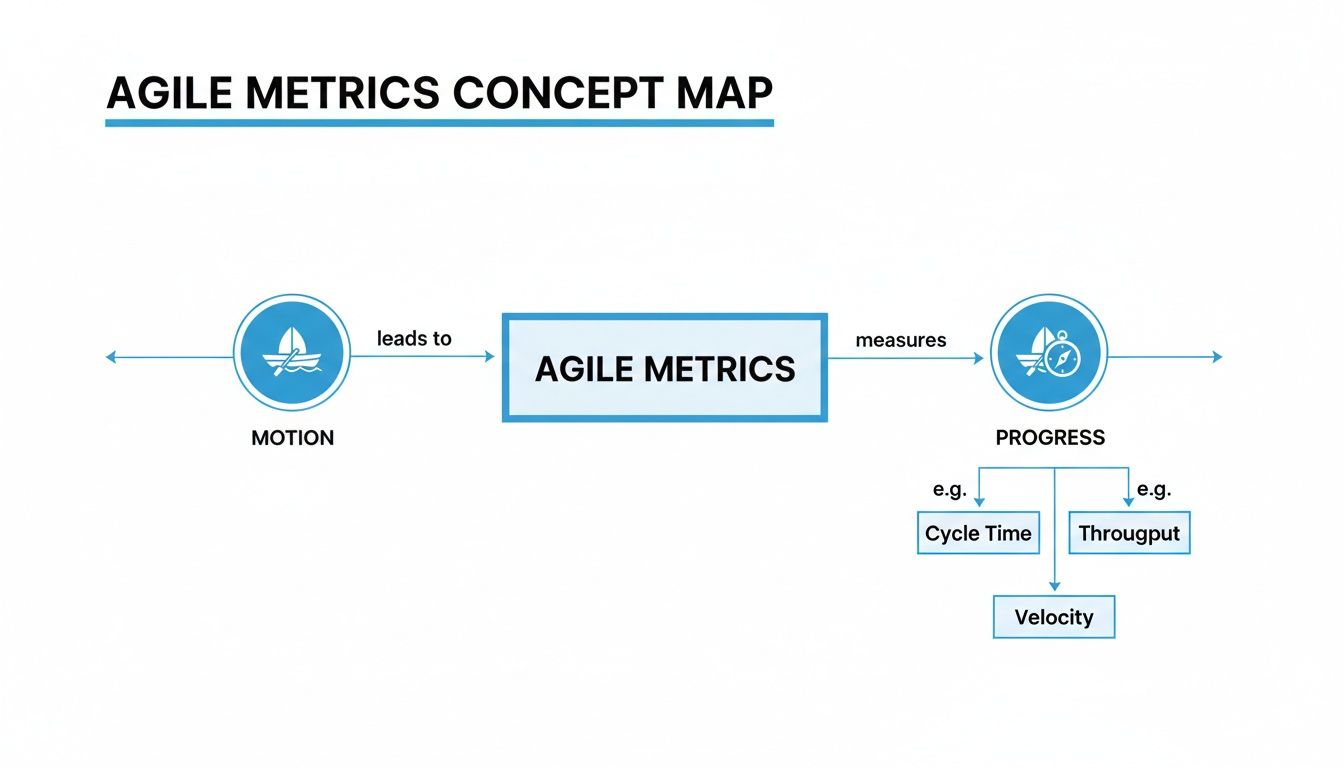
The image drives home a simple point: activity without direction is just wasted energy. Metrics are the compass that ensures your team’s effort actually leads to valuable outcomes.
Lead Time: The Customer’s Perspective
Lead Time is the big one. It measures the total time from the moment a request is made until it’s delivered and in the customer’s hands. Think of it like ordering a pizza; lead time is the full duration from when you place your order to the moment it arrives at your door.
This metric is so crucial because it directly reflects the customer’s experience. A shorter lead time means you’re more responsive to market needs and can deliver on promises faster. If your lead time is consistently long or creeping upwards, it’s a huge red flag that your overall process—from idea to release—has friction somewhere.
Cycle Time: The Team’s Perspective
Now, while it sounds similar, Cycle Time is different. It measures the time from when active development work begins on a task to when that task is completed. Back to our pizza analogy, cycle time is from the moment the kitchen starts making your pizza until it’s boxed up and ready for delivery.
This is a powerful diagnostic tool for the development team itself. A rising cycle time is a classic indicator of a hidden bottleneck. Maybe code reviews are taking forever, or the testing phase is a traffic jam. By tracking cycle time, teams can pinpoint and fix inefficiencies that are squarely within their control.
A team’s goal should be to make their Cycle Time as small and predictable a portion of the overall Lead Time as possible. This shows the development process itself is efficient, even if upstream ideation or downstream deployment processes add extra time.
Monitoring both gives you the full picture. You might have a lightning-fast cycle time but a painfully long lead time. This tells you that work is just sitting in a backlog for weeks before the team even touches it. That’s not a development problem; it’s a prioritization or planning issue.
Throughput and Work in Progress
These two metrics are two sides of the same coin, and they are all about managing the actual flow of work.
-
Throughput is simply the number of work items your team finishes in a given time period, like a week or a sprint. It’s the raw output of your system. It’s not about how busy you are, but about how much value you actually ship.
-
Work in Progress (WIP) is the number of tasks currently being worked on at any given moment. This includes anything that’s been started but not yet finished—whether it’s in development, under review, or being tested.
The secret sauce here is to actively limit your WIP. Imagine a highway with too many cars; you get a traffic jam where nobody moves quickly. The same thing happens in software development.
By setting explicit WIP limits—for example, “no more than five items in progress at once”—you force the team to focus on finishing tasks before starting new ones. This simple change has a massive impact. Limiting WIP almost always improves throughput and slashes cycle time. It kills context-switching, encourages collaboration to get tasks “done-done,” and makes bottlenecks painfully obvious.
Key Flow Metrics at a Glance
To make sense of how these metrics work together, it helps to see them side-by-side. Each one answers a different, vital question about your team’s delivery capability.
| Metric | What It Measures | Primary Question It Answers | Ideal Trend |
|---|---|---|---|
| Lead Time | Total time from customer request to delivery. | ”How long does it take for us to deliver value to our customers?” | Decreasing & Stable |
| Cycle Time | Time from when work starts to when it’s finished. | ”How long does it take our team to complete a task once we start?” | Decreasing & Stable |
| Throughput | The number of work items completed per time unit. | ”How much work are we completing over time?” | Increasing & Predictable |
| WIP | The number of tasks currently in progress. | ”How much work do we have in flight right now?” | Low & Stable |
This table isn’t just a list of definitions; it’s a diagnostic toolkit. When you see one metric trending in the wrong direction, the others often hold the clues to understanding why. A well-balanced team keeps an eye on all of them to maintain a healthy, sustainable pace.
Essential Metrics for Sprint and Team Performance
While flow metrics give you that bird’s-eye view of your entire system, sprint-based metrics are where the rubber meets the road. They zoom right into a team’s execution within a specific timebox, like a two-week Scrum sprint.
These are the metrics that give you a real-time pulse on progress, predictability, and whether the team can actually deliver on its commitments. They’re all about answering one crucial question: “Are we going to hit our goal this sprint?”
Agile isn’t some fringe practice anymore. Over 70% of organizations use it for software development, and by 2021, a whopping 86% of software teams had jumped on board. With Scrum being the go-to framework for 87% of those teams, understanding sprint-focused metrics is non-negotiable. You can dig into the full data on agile adoption rates to see just how widespread this shift is.

Velocity: A Forecasting Tool, Not a Weapon
Velocity is easily one of the most famous—and most misused—metrics in the Agile world. At its core, velocity is just the average amount of work a team gets done in a sprint, usually measured in story points. Its whole purpose is forecasting, not grading performance.
Think of it like the miles-per-gallon rating for your car. Knowing you get 30 MPG helps you estimate how far you can drive on a full tank. In the same way, knowing a team’s average velocity is 30 story points helps them make a realistic plan for what they can tackle in the next sprint.
The biggest anti-pattern I see is managers using velocity to compare teams or, even worse, pushing a team to “increase their velocity.” This is a recipe for disaster. It just encourages teams to inflate their estimates or cut corners on quality to make the numbers look good.
The real power of velocity is in its trend. A stable, predictable velocity is the sign of a healthy, mature team. If it’s all over the place, that’s a red flag—it tells you the team is struggling with planning, getting hit with constant interruptions, or dealing with inconsistent work.
Burndown and Burnup Charts: Your Sprint’s GPS
If velocity is your fuel efficiency, then Burndown and Burnup charts are your in-sprint GPS. They show you, day by day, if you’re on track to reach your destination on time.
- Burndown Chart: This tracks the work remaining in a sprint. The line should trend steadily downward, hitting zero by the last day. If that line flatlines or starts ticking up, it’s an immediate signal that something’s wrong.
- Burnup Chart: This one flips it around and tracks the work completed. It gives you a clean visual of the team’s cumulative progress. It’s also great for spotting scope creep if you plot the total scope on the same chart.
Both charts make progress tangible. They turn an abstract sprint commitment into a simple visual that everyone can see, helping the team correct its course long before the sprint review.
Sprint Goal Success Rate: Focusing on Outcomes
Finishing every single task is great, but did the team actually achieve the goal? The Sprint Goal Success Rate is all about measuring how often a team delivers on the main objective for the sprint. This metric forces a shift in mindset from just completing tasks to delivering a valuable, working piece of the product.
For instance, a sprint goal might be to “Implement a secure checkout process.” The team might finish 8 out of 10 tasks. If that checkout process is live and secure, the sprint goal was a success—even if a few minor tasks got left behind. Tracking this helps teams focus on delivering real outcomes, which is what agile is all about.
Measuring Software Quality and Reliability
Shipping features fast is a hollow victory if the product is riddled with bugs. A truly agile team knows that speed must be balanced with stability. This is where a specific class of metrics comes in—they act as the guardians of your product’s quality and your users’ trust.
These metrics shift the conversation from “how fast?” to “how well?” They give you a clear, data-driven picture of your codebase’s health and how effective your quality assurance really is. Without them, you’re just flying blind, risking a mountain of technical debt and a frustrated user base.
Tracking Defects Before and After Release
Two of the most fundamental quality metrics tell a simple story: where and when are you finding bugs? The answer reveals a lot about the effectiveness of your testing and review processes.
-
Defect Density: This measures the number of confirmed bugs found in a specific period, divided by the size of the software (usually in lines of code or story points). A high defect density in new code is a red flag. It often points to sloppy development practices or poorly defined requirements.
-
Escape Rate: This is the big one. It tracks the percentage of defects that your internal testing missed and that “escaped” into production, only to be found by actual users. This is a direct measure of your quality safety net. A high escape rate means that net has some serious holes.
Keeping an eye on these numbers helps you spot trends. Did your escape rate suddenly spike? Maybe it’s linked to that rushed release last month or a change in your testing strategy. It gives you a concrete starting point for your next retrospective. To go deeper, check out our detailed guide on how to measure software quality.
Bridging Metrics with Realistic Validation
Here’s the catch: metrics like escape rate are lagging indicators. They tell you about a problem after it’s already happened. Modern engineering practices aim to be more proactive by validating quality under realistic conditions before a release even happens. This is where traffic replay becomes a total game-changer.
Think of your testing environment as a pristine, quiet library. It’s great for focus, but it’s a poor simulation of a chaotic city square during rush hour. Your production environment is that city square, full of unpredictable users, complex interactions, and sudden traffic surges.
Traditional testing often validates code in a sterile environment, which is like practicing for a championship game in an empty stadium. It’s a useful start, but it doesn’t prepare you for the pressure and chaos of the real event.
Tools like GoReplay bridge this gap. By capturing real production traffic and replaying it in your staging environment, you move from guesswork to genuine validation. This isn’t just a theoretical check; it’s a direct simulation of reality. You’re no longer just testing if a feature works in isolation—you’re testing if it can withstand the exact load and user patterns it will face in the wild.
Making Reliability Metrics Tangible
This approach turns abstract reliability metrics into something concrete and provable. Take Mean Time to Recovery (MTTR), a crucial DORA metric that tracks how fast your team can fix things when they break. A low MTTR is great, but how can you be sure you can achieve it without an actual outage?
With traffic replay, you can be proactive. You can simulate a past incident or a massive traffic spike by replaying that exact traffic against a new build. This unlocks a few powerful capabilities:
- Validate Fixes: Confirm that a bug fix actually works under the precise conditions that caused the original failure. No more crossing your fingers.
- Test System Resilience: See how your application and infrastructure hold up under extreme load before it ever hits production.
- Practice Incident Response: Let your team run realistic drills, measuring their recovery time in a completely safe environment.
By integrating traffic replay into your CI/CD pipeline, you create a direct link between agile planning and operational readiness. The focus shifts from reactively tracking defects to proactively preventing them and proving your system can handle real-world chaos. Quality assurance transforms from a chore into a core engineering discipline.
Using DORA Metrics for Elite DevOps Performance
While sprint metrics help teams fine-tune their day-to-day execution and flow metrics optimize the bigger picture, DORA metrics take the conversation to a whole new level: strategic business impact. These aren’t just vanity numbers; they are the four key metrics identified through years of research by the DevOps Research and Assessment (DORA) team that separate elite-performing organizations from everyone else.
Think of them as the gold standard for measuring how effective your entire software delivery process is, directly connecting engineering excellence to real business outcomes.

Deployment Frequency
How often do you successfully release code to production? That’s the simple but powerful question Deployment Frequency answers. The best of the best deploy on-demand, multiple times a day. A high deployment frequency isn’t about pushing code carelessly; it’s a sign of a mature, automated, and incredibly reliable delivery pipeline.
It’s like the pulse of your development capability. A strong, frequent pulse means you have a healthy, responsive system. To get there, teams invest heavily in CI/CD automation, trunk-based development, and a rock-solid automated testing suite.
Lead Time for Changes
From the moment a developer commits code to the main branch, how long does it take for that change to land in production? That’s your Lead Time for Changes. This metric zeros in on the speed and efficiency of your delivery pipeline itself.
Elite teams measure this in minutes, with a lead time of less than one hour. A short lead time means your code review, testing, and deployment steps are fast and frictionless. If this number is high, it’s a huge red flag pointing to bottlenecks like manual approval gates, sluggish build times, or inefficient testing cycles.
DORA metrics are a balanced system. Chasing a high deployment frequency without also improving lead time and maintaining quality is a recipe for disaster. The goal is to move faster and safer, not just faster.
To drive this number down, you need to optimize every single step after the commit. This could mean parallelizing tests, creating clear guidelines to speed up code reviews, and generally making sure your CI/CD pipeline is a well-oiled machine.
Change Failure Rate
When you do deploy, what percentage of those deployments cause a failure that needs an immediate fix, like a hotfix or a rollback? This is your Change Failure Rate (CFR), and it’s a direct measure of the stability and quality of your releases.
Elite performers keep their CFR between 0-15%. That might sound impossible—how can you deploy constantly and not break things? The secret is deploying small, incremental changes. Pushing tiny batches of code is inherently less risky than one massive, “big bang” release.
To get your CFR down, you should focus on:
- Comprehensive automated testing: Catch bugs long before they see the light of day in production.
- Solid peer review processes: Get more eyes on every change to spot potential issues.
- Smart release strategies: Use canary releases or feature flags to roll out changes gradually, limiting the blast radius if something goes wrong.
Mean Time to Recovery
Sooner or later, a failure in production will happen. When it does, how long does it take to restore service? That’s your Mean Time to Recovery (MTTR). This metric is all about resilience and how effectively your team can respond when things go sideways.
Elite teams can recover from an incident in less than one hour. A low MTTR is a clear indicator of robust monitoring, well-practiced incident response drills, and the ability to diagnose and ship a fix in a hurry. Tools like infrastructure-as-code and automated rollback procedures are your best friends for slashing recovery times.
Together, these four metrics paint a complete picture of your DevOps performance. They create a powerful feedback loop: deploying small batches often (high DF, low LTC) lowers the risk of each deployment (low CFR), and if a failure does slip through, the team can fix it fast (low MTTR).
How to Avoid Common Metric Traps and Anti-Patterns
Agile metrics can light up the path to improvement, but they can also cast some seriously misleading shadows if you use them the wrong way. Figuring out the common anti-patterns is the key to turning data into a tool for growth instead of an instrument of fear. The goal should always be to use metrics to start conversations, not end them by pointing fingers.
One of the most destructive traps is weaponizing metrics against people or teams. The moment a manager uses a burndown chart to publicly call out a developer for a flatlining trend, a culture of fear takes root. This pressure doesn’t inspire better performance—it just encourages people to game the system.
This kind of toxic environment leads to all sorts of defensive behaviors that poison the agile process. Developers might start breaking down tasks into meaninglessly tiny pieces or marking work as “done” when it’s really not, just to make the chart look good. The metric’s original purpose is completely lost.
The Comparison Game Never Wins
Comparing velocity between different teams is another classic mistake. Let’s say you have two teams, Team A and Team B, working on different parts of an application. Team A reports a velocity of 40 story points per sprint, while Team B reports 25. A manager might glance at this and wrongly conclude that Team A is “better” or “more productive.”
This is a fundamental misunderstanding of what velocity actually is.
- Story points are relative, not absolute. A “5-point” story for Team A could be wildly different in complexity from a “5-point” story for Team B. They have their own internal scale.
- Context is everything. Team A might be cruising through familiar front-end features, while Team B is deep in the trenches, wrestling with a complex legacy backend system.
Comparing the velocity of two different agile teams is like comparing the speed of a car in miles per hour to a boat in knots. The numbers aren’t interchangeable, and trying to judge one by the other’s scale is pointless and misleading. The only valid comparison for velocity is a single team’s trend over time.
Avoiding Tunnel Vision on a Single Metric
Obsessing over a single metric is a fast track to unintended consequences. For instance, if a team is laser-focused on increasing its Throughput (the number of tickets closed), they might start cutting corners on quality assurance just to get things out the door.
Sure, they’re pushing more features, but it comes at a cost. Soon, the Escape Rate (bugs found in production) starts to climb. The team is technically delivering more, but they’re also creating a mountain of rework for themselves and a buggy experience for their users. You need a balanced diet of metrics that gives you the full picture—speed, quality, and real outcomes.
To build a healthy metrics culture, keep these principles in mind:
- Metrics are for the team, by the team. The primary audience for most agile metrics should be the team itself, helping them see their own process clearly so they can inspect and adapt.
- Focus on trends, not absolute numbers. A single data point is just noise. The real story is in the trendline. Is cycle time getting better? Is velocity stabilizing? That’s where the insights are.
- Use metrics to ask “why,” not “who.” When a metric flags a problem, the goal isn’t to find someone to blame. It’s about getting together to investigate the root cause within the system. This approach is what turns data into a catalyst for genuine, lasting improvement.
Got Questions About Agile Metrics? We’ve Got Answers.
Even after you’ve got the basics down, a few practical questions always seem to pop up. Let’s tackle some of the most common ones we hear from developers, managers, and QA pros to clear up any lingering confusion.
Which Metric Is the Most Important?
This is a trick question. There is no single “most important” metric. In fact, chasing one number while ignoring the others is a classic mistake that can seriously skew a team’s priorities. If you focus only on jacking up Velocity, for example, you’ll probably see your Escape Rate (bugs found in production) skyrocket as the team cuts corners to go faster.
The best teams take a balanced approach. They monitor a handful of metrics across a few key categories to get a complete picture of their health:
- Flow Metrics (like Cycle Time) to see how efficiently work moves through the system.
- Quality Metrics (like Change Failure Rate) to make sure what they ship is stable.
- Team Metrics (like Sprint Goal Success Rate) to track how well they’re executing their plans.
How Often Should We Be Looking at Our Metrics?
The right rhythm really depends on the metric itself. Sprint-based metrics, like a Burndown Chart, are most useful when you glance at them daily during stand-ups to make sure you’re still on track. On the other hand, Flow metrics like Cycle Time and Throughput are better analyzed over a longer period—think bi-weekly or monthly—to spot meaningful trends instead of just noise.
The goal is to weave metrics into your team’s regular conversations, not just pull them out for a quarterly report. Use them in retrospectives to ask “why?” and kickstart real discussions about improving your process.
Is It Okay to Compare Metrics Between Two Different Teams?
You should absolutely never compare output-based metrics like Velocity or Throughput between different teams. It’s a recipe for disaster. Every team has its own unique context—the complexity of their work, the experience of the members, even how they estimate points. Direct comparisons are not just meaningless; they’re a great way to destroy morale.
What you can do, however, is benchmark outcome-focused metrics, like the DORA framework’s Lead Time for Changes or MTTR (Mean Time to Restore). These reflect the health of your entire delivery system, and looking at them across teams can help you pinpoint systemic bottlenecks that might be holding everyone back.
Help! My Team Isn’t Hitting Its Velocity Target. What Do I Do?
First, take a deep breath and remember that velocity is a forecasting tool, not a performance target to be hit with a stick. A fluctuating velocity isn’t a sign of failure; it’s a signal that something is going on. Instead of blaming the team, get curious and use it as a prompt to investigate what’s really happening.
Some of the usual suspects for inconsistent velocity include:
- Constant interruptions and unplanned work derailing the sprint.
- User stories with vague or incomplete requirements.
- Hidden technical debt that’s slowing everyone down.
Use this data to have a constructive, blameless conversation in your next retrospective. The goal isn’t to “hit the number” but to build a stable, predictable process. Once you start focusing on removing the real roadblocks, a more consistent velocity will naturally follow.
Make sure your team is validating software quality with the chaos of the real world. GoReplay lets you capture and replay your actual production traffic, turning real user activity into your most powerful testing asset. Mitigate risks and deploy with confidence. Learn more at https://goreplay.org.